Collaborative Process
Role:
User Experience Design Consultant
Duties:
- User Research
- Information Architecture
- Interaction Design
- Product Testing
Duration:
Sep 2015—Nov 2015
How an open design process resulted in better project collaboration, minimal documentation, and overall stakeholder satisfaction.
The Client
This particular client is in the education and training sector, offering courses both in-person and online for pre-college and adult students who want to learn web development, mobile development, and more. Because of an existing NDA, there is a limited amount of detail that I can share.
The Problem
I was hired to work with the marketing and product teams in order to improve the search and e-commerce experience for the organization's website. The main goal was to increase conversion rates for course enrollments and checkouts, with additional goals of lead generation, brand messaging, and overall alignment of the user experience.
The Project
What began as a revamp of the search and e-commerce functionality ended up morphing into a merger of a subdomain into the main dot-com site. Through the research phase (described in more detail later on in this study), the disconnect between the pre-college experience and the experience for the adult student became more apparent for the stakeholders. This necessitated a pivot in the project in order to tackle a higher value problem.
The Process
Research
This project was very open from the beginning. Upon commencement, the team shared all of the research and materials they had to date — market schedules, acquisition plans, analytics, site maps, and website feedback. They had even already gone through a persona development exercise based on interviews with existing users — excellent work! From there, I reviewed the material and asked questions as they came up, filling in the holes along the way.
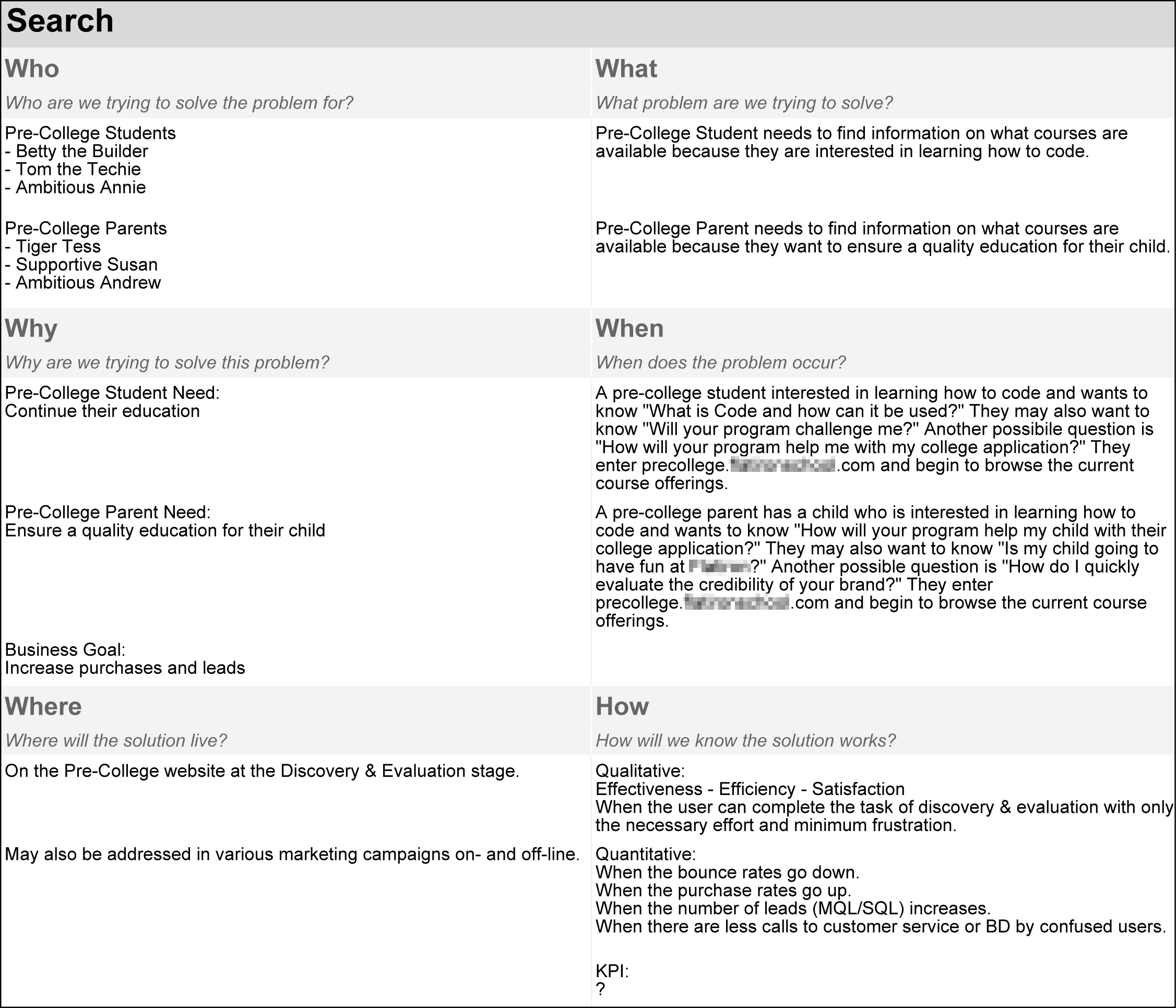
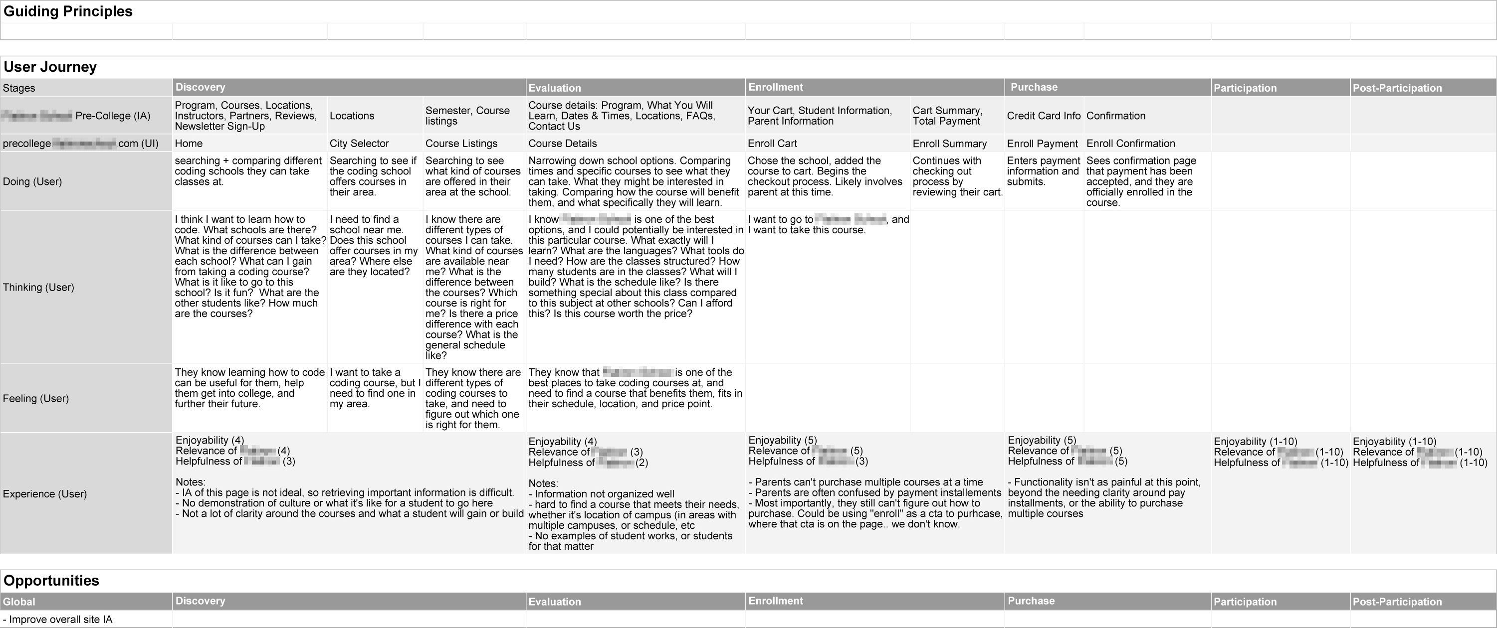
With the help of the internal team, we created two main artifacts in this phase: a problem definition sheet and a journey map for the two main personas. The problem definition — based on the questions Who, What, Why, When, Where, and How — is a tool I use to add focus to the project, alignment among the stakeholders, and proof that we're solving the right problem. The journey map, which in this case was more of a proto-journey map (with only have roughly 50% of the information backed by research), serves also to gain alignment among stakeholders, but also to step back and see the bigger picture while shining a light on the holes in existing research and data. Although I cannot confirm this, it is my belief that these two artifacts are also what inspired the project pivot.
With the pivot, we also included the additional artifact of a subdomain inventory to ensure that none of the crucial pages got lost in the site merger.
Design
Through the course of conversation in the Research phase, design principles were established for the project to adhere to. These serve as a guiding light for decision making during the Design phase to help keep the project on track.
Design Principles
- Simplicity
- Scalability
- Clarity
- Consistency
- Continuity
- Incremental Change
- Mobile First
With these principles in mind, a current state analysis was done for the information architecture, user flows, and page templates. This helps serve as a base to be measured against at the end of the project as well as help account for any disparities. It also helps me as a non-core team member to better understand the current system and the problem we're trying to solve.
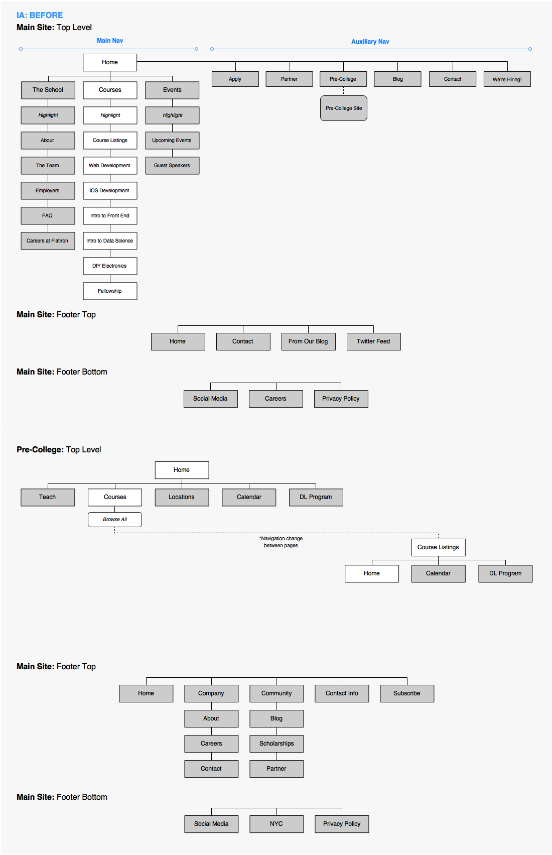
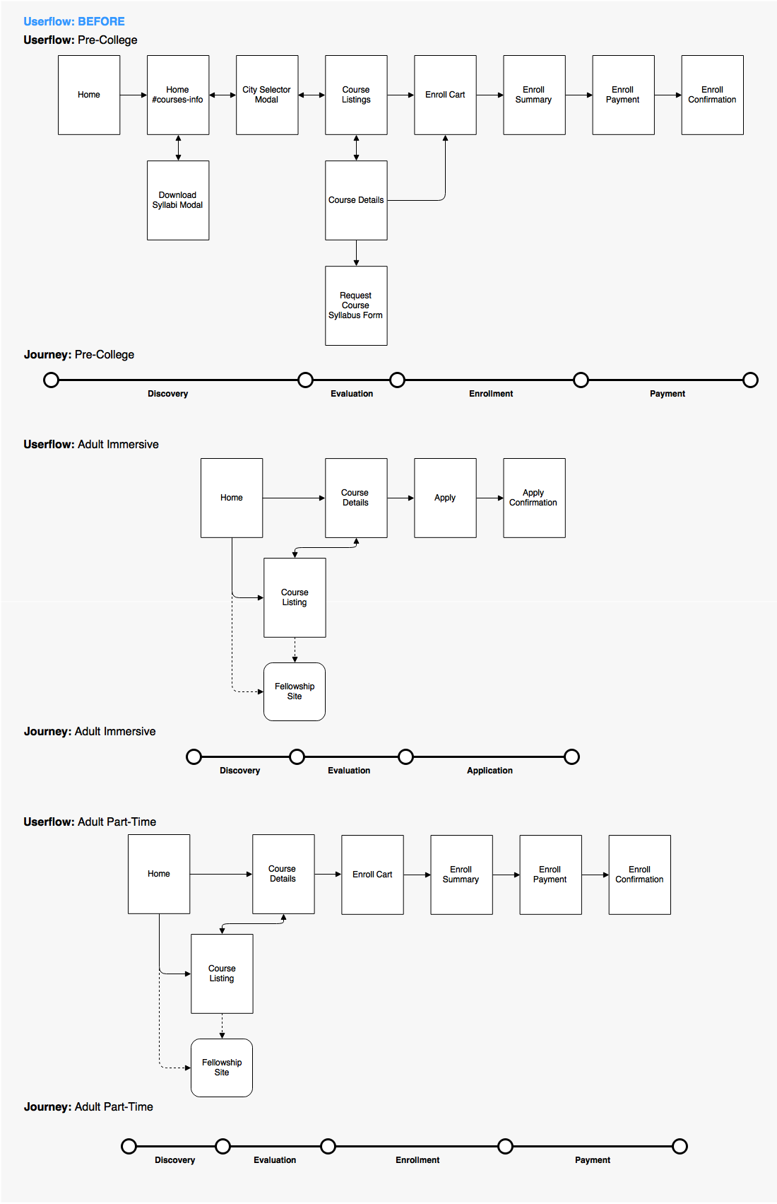
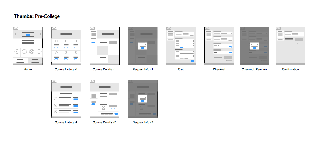
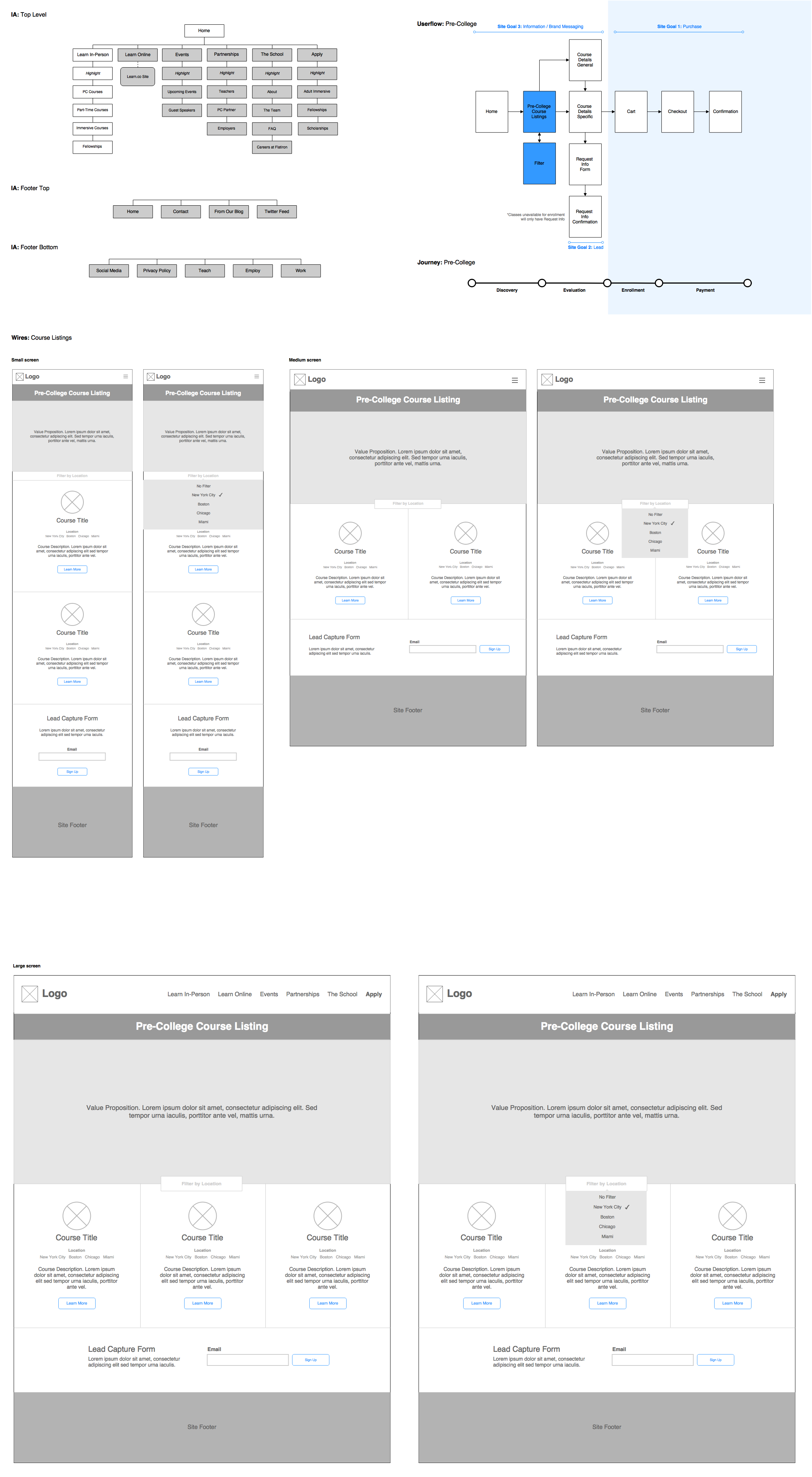
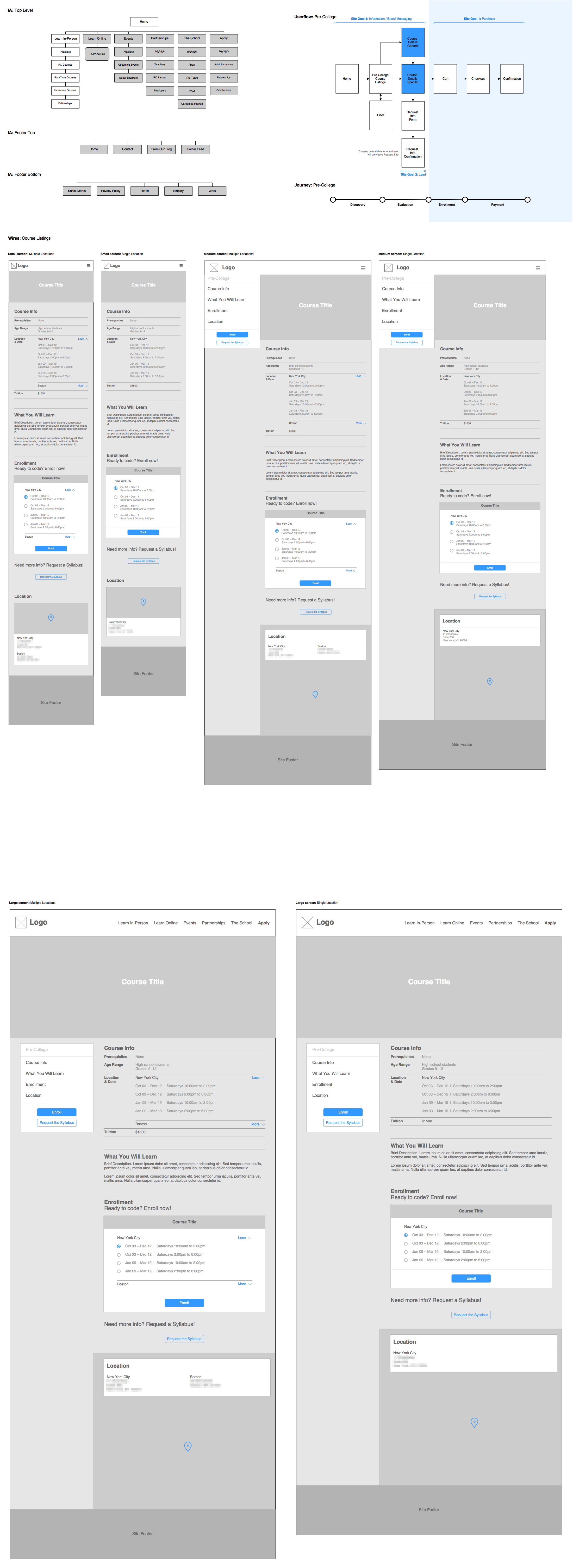
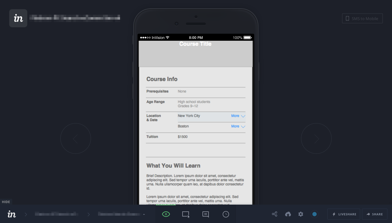
Based on the issues found during the current state analysis, suggestions were made through new site maps, user flows, and wireframes for page templates. These artifacts were then reviewed, discussed, and iterated on as a team to ensure that alternate perspectives were being included as well as address any holes in the design. As a proof of concept, the templates were stitched together as a testable prototype to check for any holes in the flow that might have been missed as well as an interactive reference for the development team.
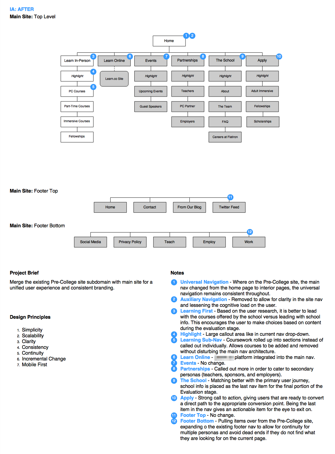

The end result was an experience that was more unified, with similar flows and interactions for pre-college and adult students that only diverged where appropriate (some flows ended with a checkout while others ended with an enrollment). This also helps to lower technical debt and maintenance in the long run.
Evaluation
The testing plan that was put together was based on the personas and scenarios covered in the journey map. The idea here is to screen participants based on the targeted persona and have them walk through tasks that are based on the scenarios discovered through research. A combination of guerrilla testing and remote unmoderated testing was intended, with guerrilla testing allowing for some in-person observation and feedback while the remote unmoderated testing allowed for recorded sessions that would later be included for executive review.
Collaboration
Aside from the UX process, a key element worth highlighting in this project is the collaboration with the team. The core team consisted of the marketing director, the lead designer, and the lead developer. Other subject matter experts were pulled in as necessary, but the different viewpoints were included every step of the way.
As the team practiced Agile, daily check-ins were delivered every morning via email with a virtual stand-up taking place over Google Hangouts. On my end, I kept a running note in Evernote to jot down any questions or notable items to include in the daily emails. This helped to keep the core team in the loop on progress, provided an open line of continuous feedback, and addressed any obstacles quickly. It also helped to create a joint level of investment and ownership of the final recommendations, which would have to go under executive review before proceeding to development.
Choices in tooling were made also based on collaboration. The IA, user flows, and wireframes were all done in Draw.io using the Google Drive plugin. It’s free with a relatively shallow learning curve, so anyone else on the team could install it to iterate on the artifacts. Google Docs and InvisionApp were also used for their collaborative functionality that is baked in. (I promise this isn't a paid product endorsement)
Additionally, I shared the project folder in its entirety out of Google Drive, encouraging the other team members to add anything they felt needed as well as allowing them to contribute to the design artifacts. Since the ultimate deliverable was an improved user experience, there were no proprietary concerns over the various versions of artifacts rendered and in fact added to the history of the project. We could at any time go back and look at previous versions that we had explored (and didn't work) to remind ourselves why certain decisions were made.
Conclusion
At the end, as can happen in any business, the project was put on hold to allow for resource allocation to a higher priority project. And although the results are still pending, the feedback I've received from the team has been overwhelmingly positive, due not only to my expertise in user experience, but to the openly collaborative process that was provided.
I have since then been contacted for additional engagements by this same client.
