Connections App
Role:
Sr UX Designer (& Architect)
Duties:
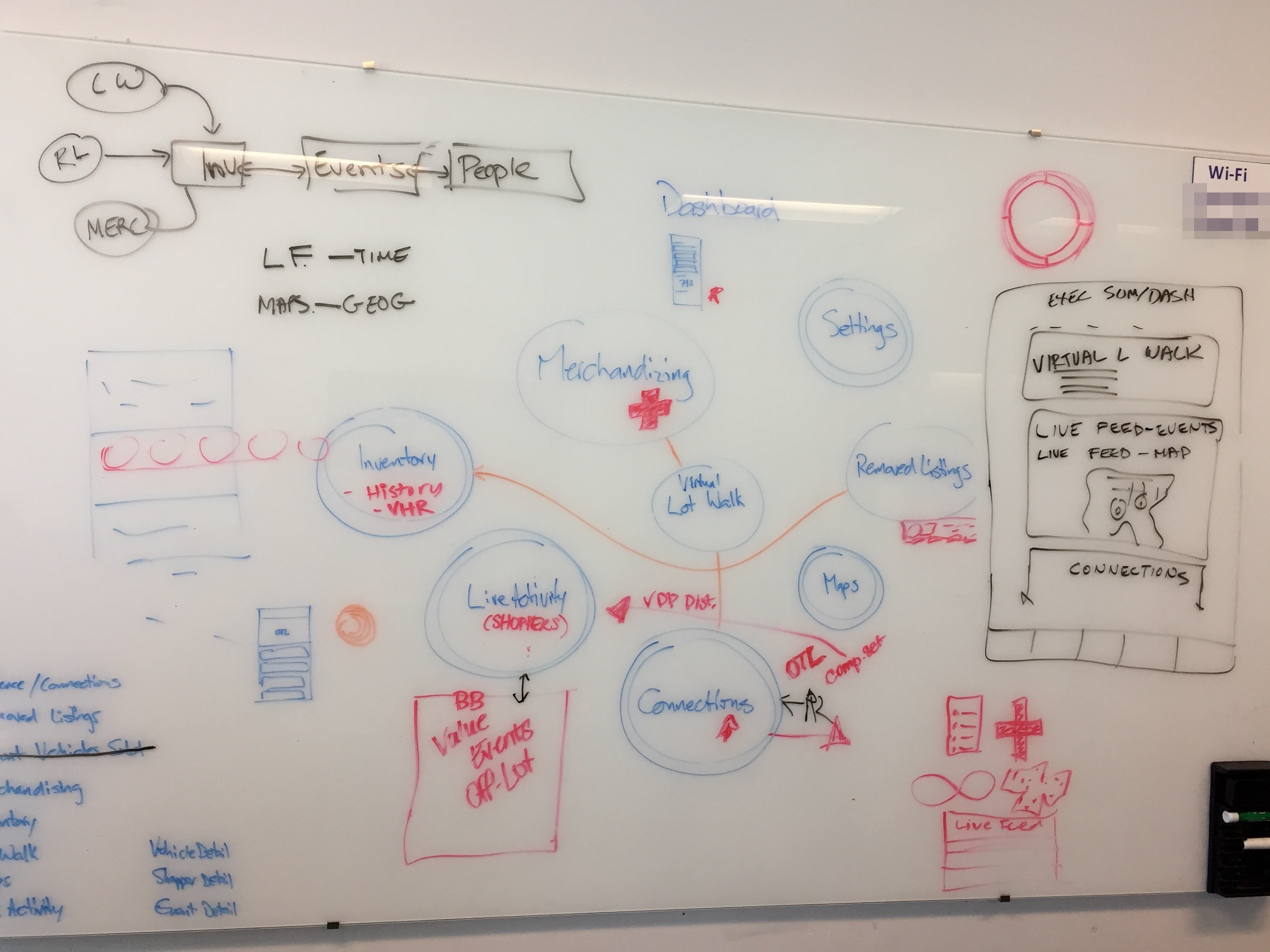
- Information Architecture
- Interaction Design
- Visual Design
- Data Visualization
- Product Identity
Company:
Autotrader, Cox Automotive
Duration:
Aug 2016—Jan 2019
Platform:
Phone; iOS & Android
How a full overhaul of an internal app became a dealership analytics tool for managing vehicle listings and enhancing the sales pipeline.
Overview
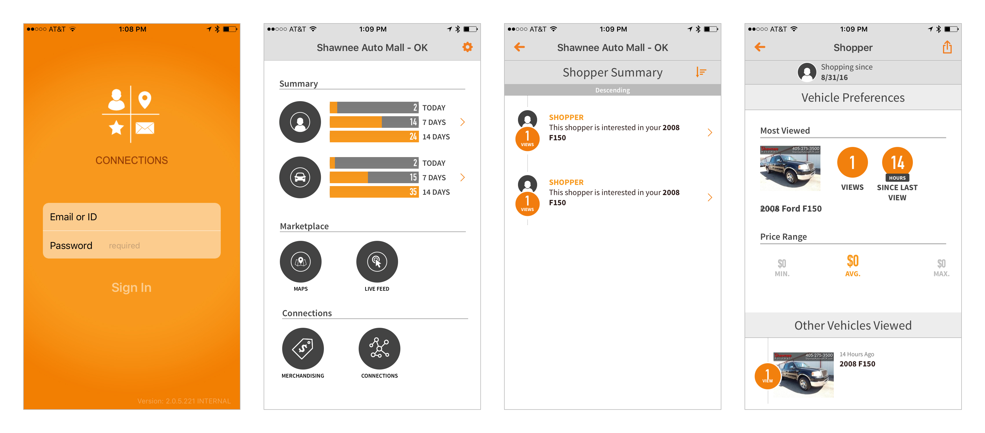
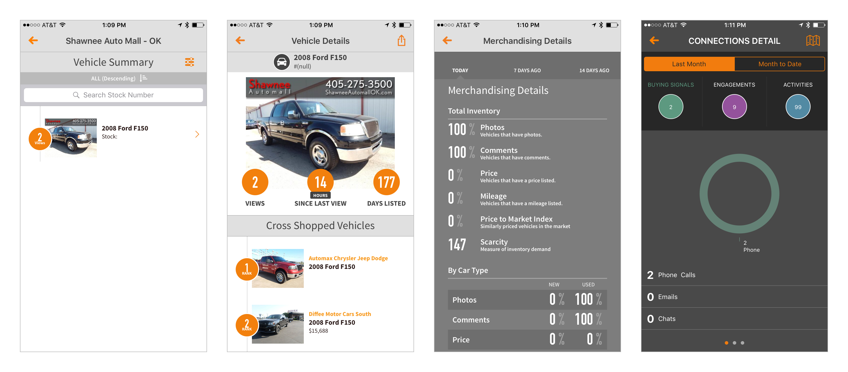
Marketing Insights was a phone-based app that field sales used as part there conversation to retain dealership subscription for Autotrader vehicle listings. In it, real-time reporting was used to show the dealer how their listings were doing to provide a better understanding of their ROI. Eventually, the app gained enough interest on the dealership side that they began asking for the app for their own listing analytics.
The Problem
Our team was asked to redesign the app, top to bottom, to take to market as a B2B solution for our dealership customers.
Users
- Dealers
- Field Sales
- Internal Corporate Users
Business Goals
- Provide timely information
- Aid in operational decisions for vehicle sales
- Demonstrate ROI for vehicle listings
- Retain dealership subscriptions
Discovery
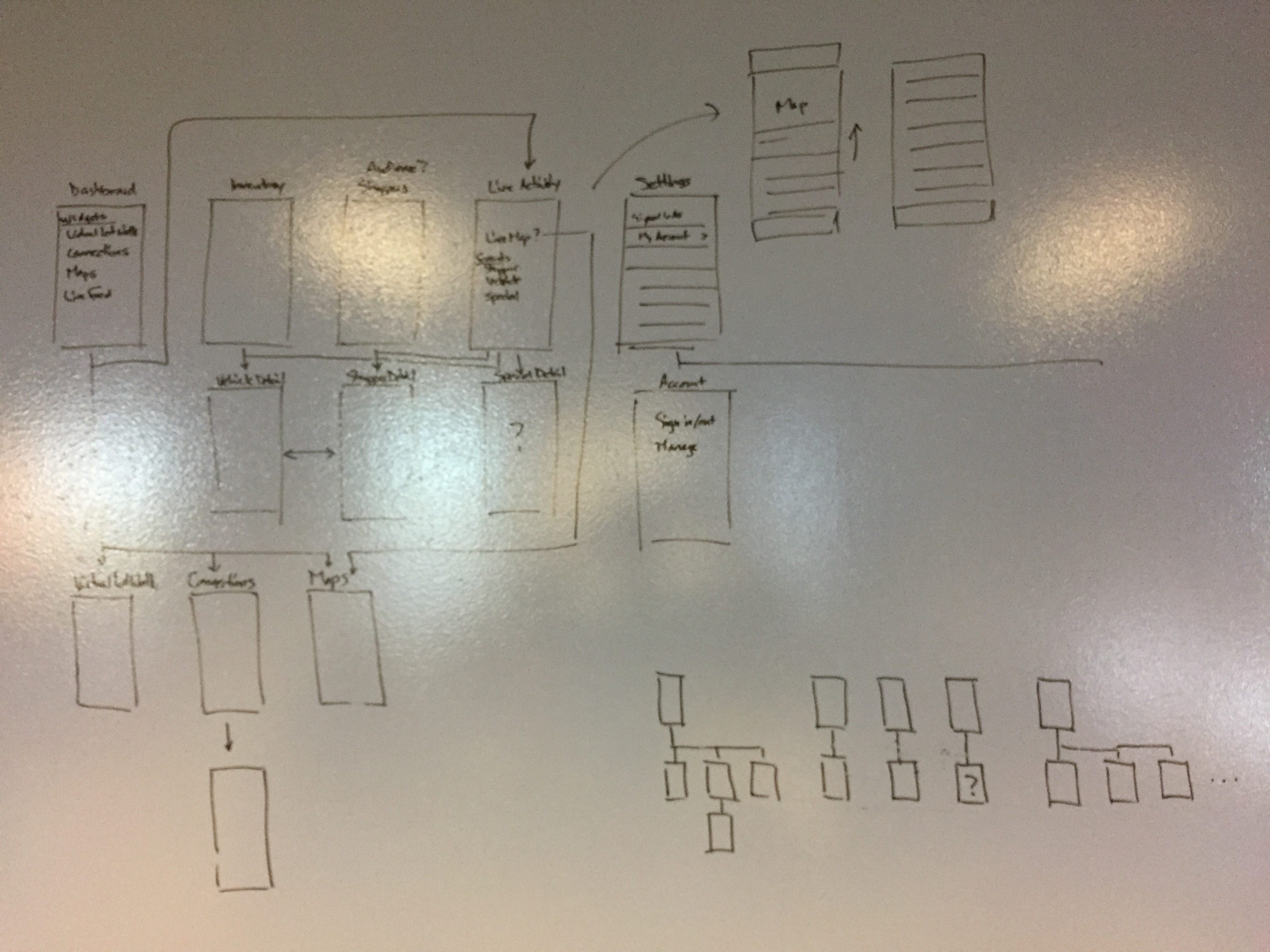
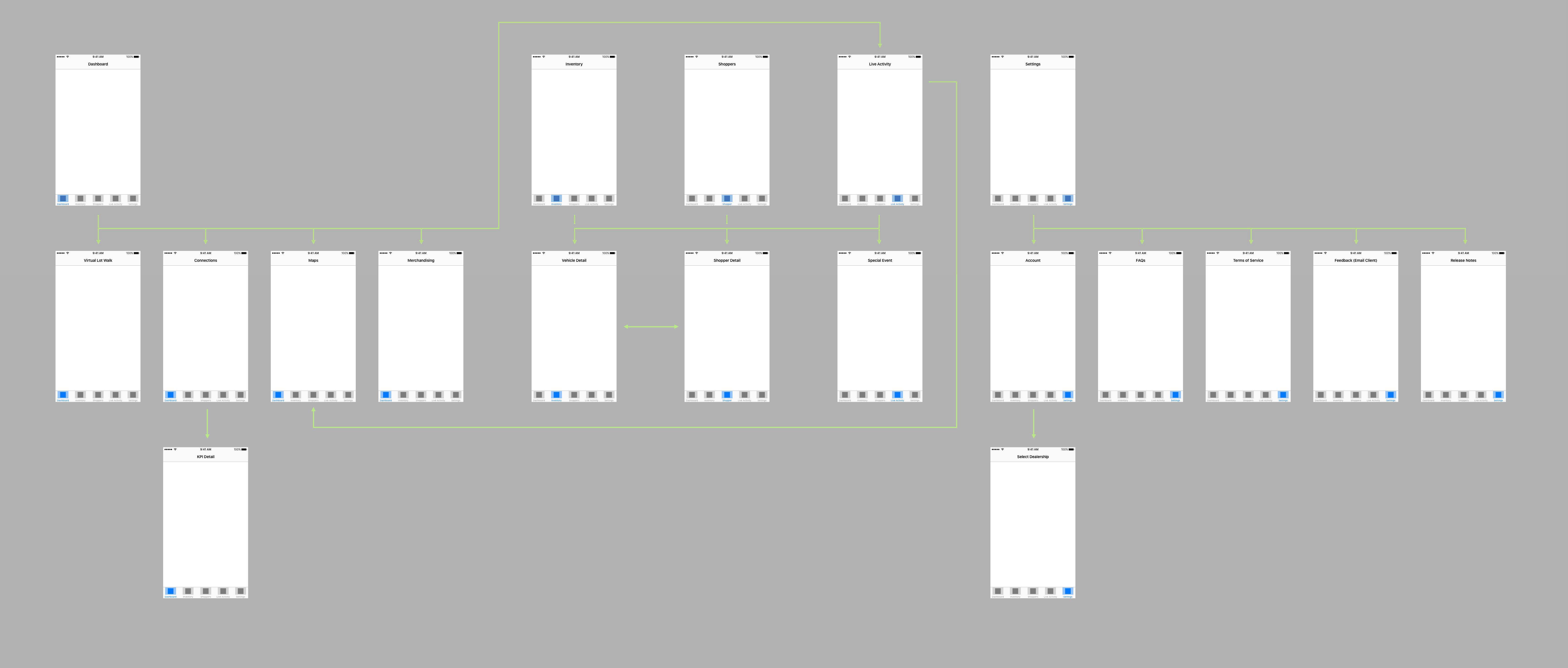
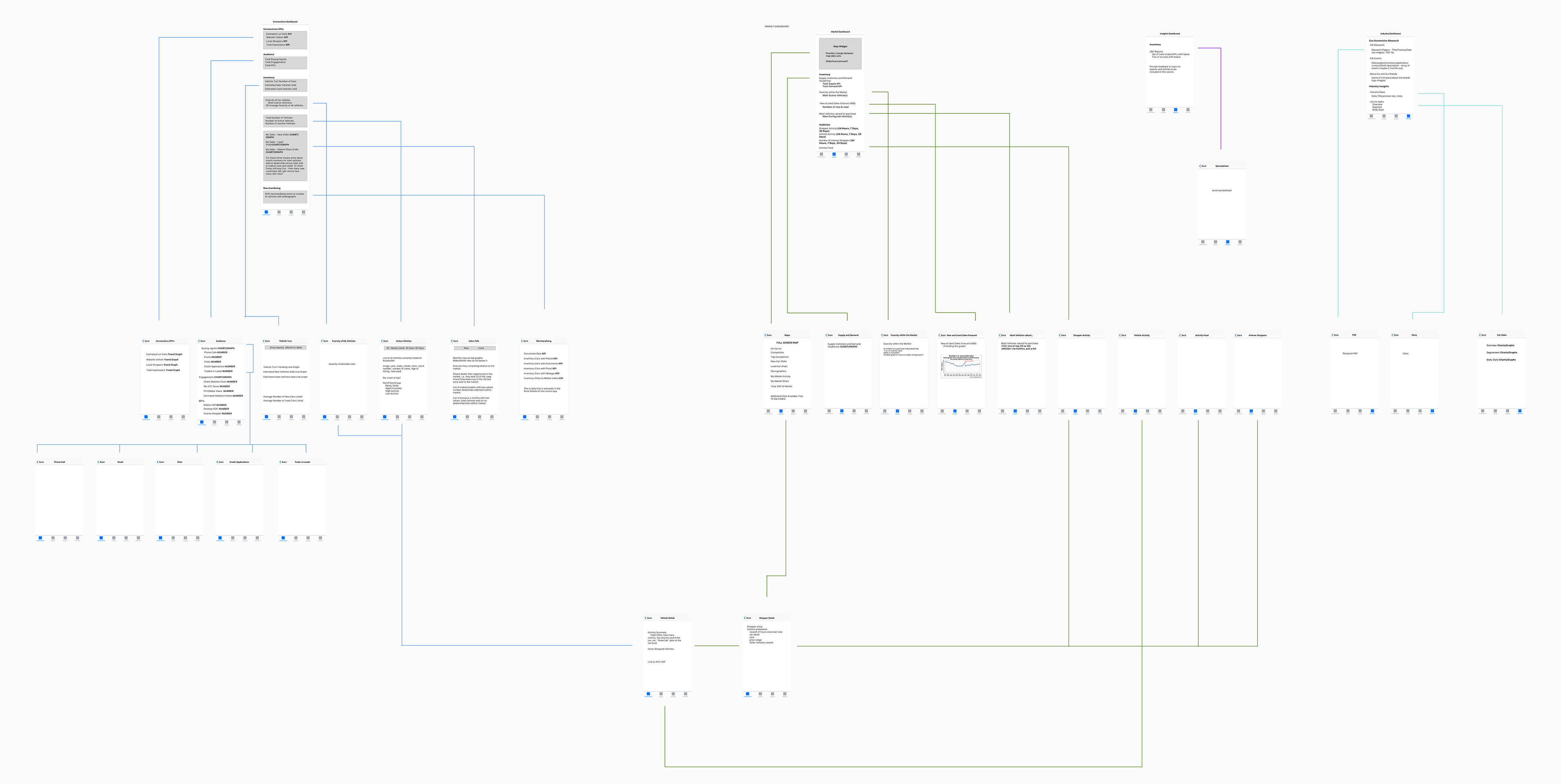
Delivery
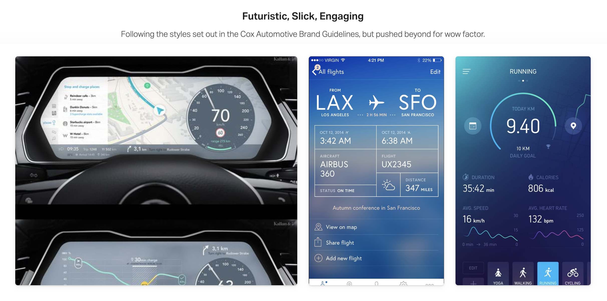
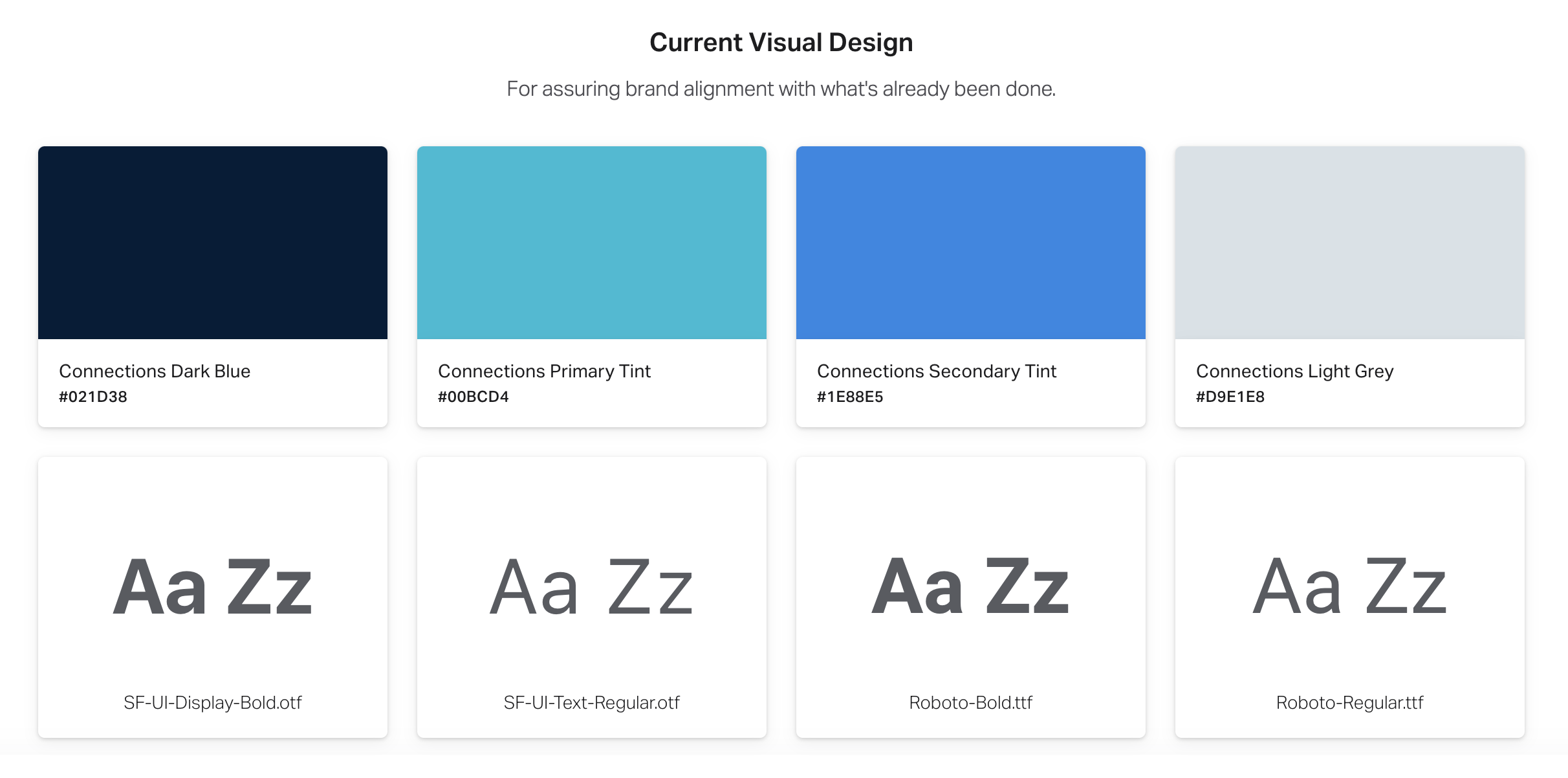
We conducted various workshops with stakeholders to form the following for the product identity and overall app design.
Voice & Feel
- Professional
- Functional (but not Utilitarian
- Inviting
Design Principles
- Useful
- Intuitive
- Engaging
- Simple
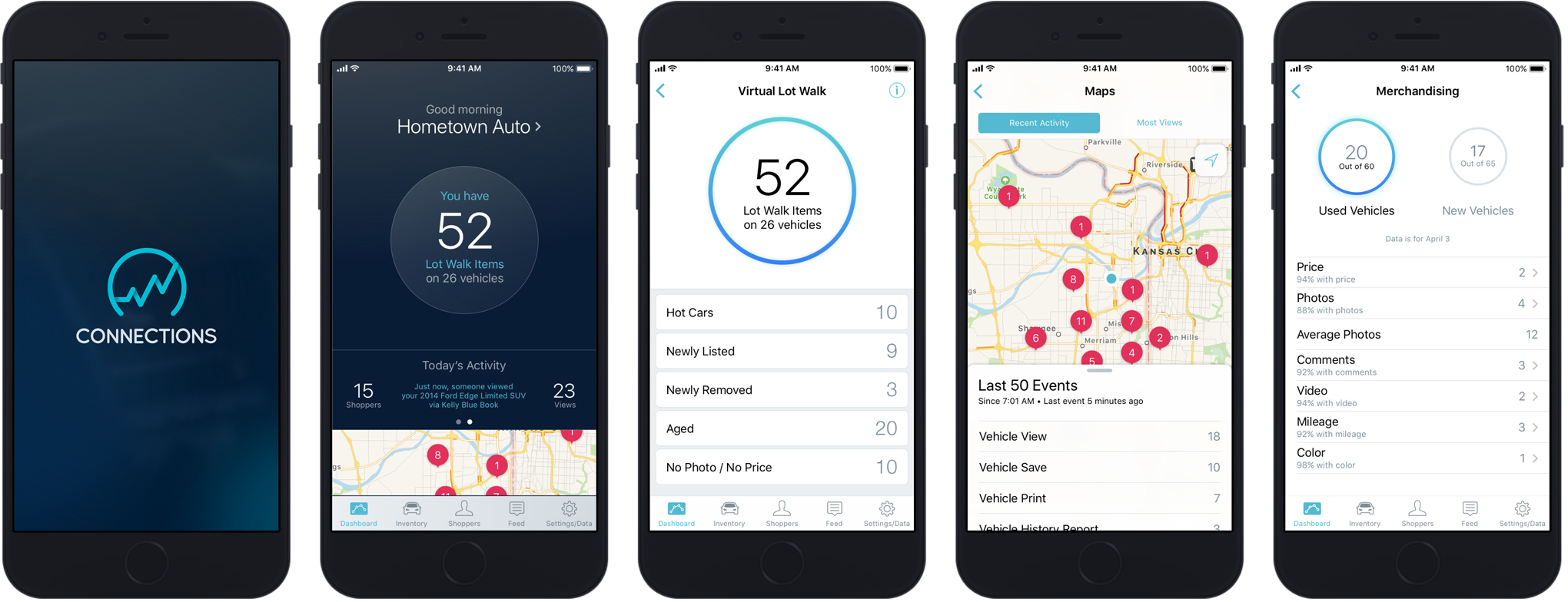
Final Designs
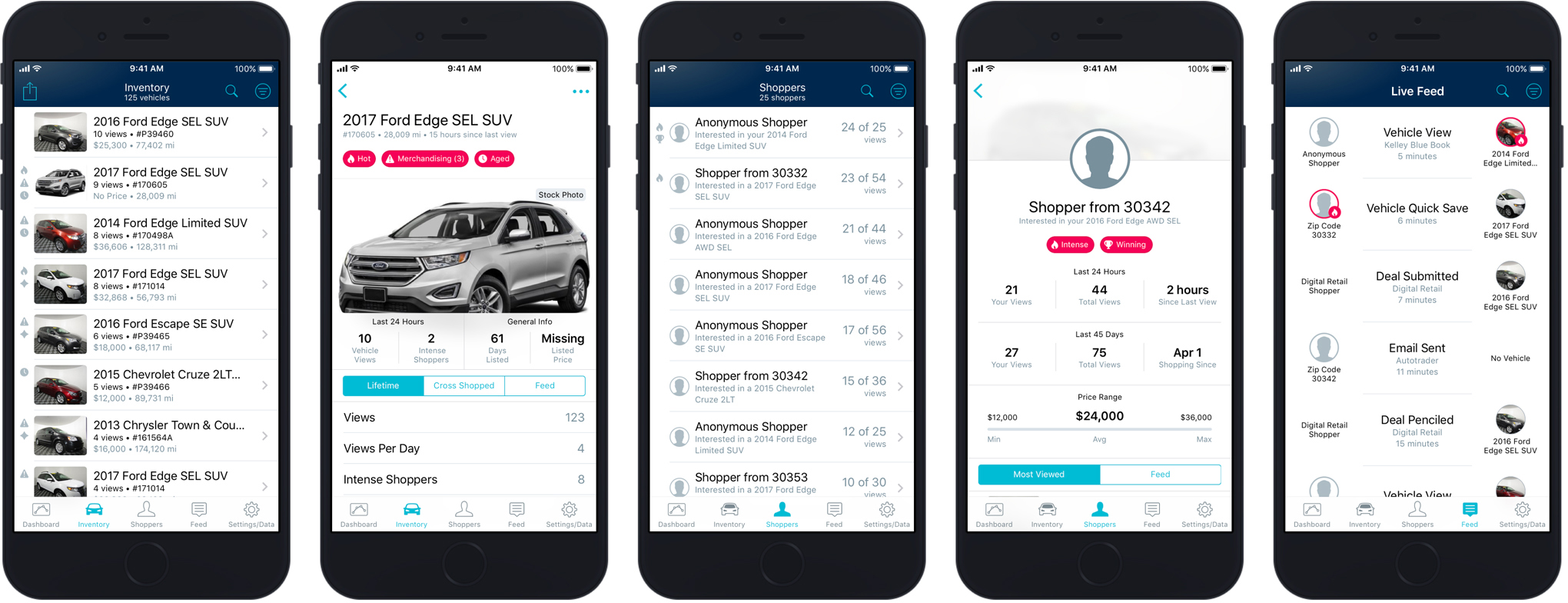
The Outcome
The newly revealed [Dealer] Connections app was launched in 2017 on both iOS and Android. It received much acclaim from dealership users and was spotlighted in an internal all-hands meeting for Cox Automotive.
