The Year of UX
Inciting Organizational Change
Over the past three years, I’ve been going through a transition. Much of it was in response to an adverse work environment, but in many ways I’ve always been on this path. Bits and pieces here and there, clues and signs, all pointing me in the direction I’ve taken. This is the story about my evolution as a Designer and how a UX process was launched.
I’ll admit, when this all started, I didn’t know what UX really was. I mean, I understood the term “user experience” and thought I was doing it, but I didn’t fully understand the process behind it. So you could say that the actual starting point of change was from the moment I truly understood what user experience — the field, the principles, the process — really meant. Aside: I’ll write more about those later.
The role that I was originally hired for had two main requirements: visual design skills and coding skills (HTML/CSS). I had both. To that, I added the creation of user flows, wireframes, and prototypes — skills that I would consider falling under interaction design. And for the first year of employment, I did my job well using all of those skills.
After that first year, things began to change internally. Departments restructured, people moved up, people moved out, and turf wars ensued. During this flux, the visual design portion of my role was usurped by the Creative Director in the name of brand management. This left me with interaction design and writing code. In theory, new projects were to start with interaction design, go to Marketing for visual design, and then come back to my team for development. In practice, only the latter happened. I was being cut out of the design process, leaving me as a front-end developer that couldn’t write JavaScript.
I was in a state of crisis. I had always identified being a Designer primarily with the visual aspect. If I no longer did the visual, was I still a Designer? The answer, of course, was yes. Design is about problem solving. It’s about making things that work, not just making them visually pleasing. I already knew that, but I struggled all the same.
If you want to watch someone suffer, take away the thing they love. And I loved visual design. Suffering is pain and pain is growth. After working past the pain of losing the visual, I began to see Design for what it really was. I also began to see opportunity and how much the organization needed a Designer who truly understood Design. Enough to fight for it.
So I fought. Not as a declaration of war — I fought for the users. I always had, but now I fought harder. And smarter. My role needed to evolve, not just for the sake of my personal happiness, but for the quality of the product and the overall user experience.
How do you know that you’ve built the right thing? How do you know it works as intended? How do you know if an interface is truly “intuitive”? Because the stakeholder told you so? No. Because you asked the people who use your product. This was the need that I originally set out to fulfill, but it became something more.
Reverse-Engineering a Process
Usability Testing
As you’ve probably gathered, I set out to launch a usability testing program. My manager and I recognized a need for product validation that came from outside the conference room. Politics were high and stakeholders loved to posture and argue, all the while the end user suffered. I couldn’t deliver the best solutions because I had to fight with people higher up the chain. You typically don’t win those fights. And the culture was very top-down.
Usability testing held the key. I had already began running “hallway tests” with people from departments that didn’t have much exposure to the application. My manager and I had also began conducting moderated testing with new hires, but we needed actual users. People that sat outside of the org chart and could care less about internal politics.
Figuring out what to test was never hard. There was always some feature or some point of contention that needed to be validated. But that’s still coming in from the business perspective. Coming in from the user’s perspective meant scripting a task that felt natural, authentic to how it would actually occur. And that meant understanding the context of use — the scenario.
Scenarios
Scenarios, at first glance, translated in my mind as another word for user stories. Our team had begun the agile transformation not long after I was hired, so my world was filled with user stories, story points, and sprints. From a UX perspective, this meant that I had a common ground to speak with the developers on. Though technically scenarios are not the same as user stories, it was enough to get the conversation started.
The trouble with scenarios and user stories is that, as the name suggests, it’s easy to tell a story. A piece of fiction that sounds convincing enough, but they’re easily distorted to your world view. The main point of a scenario is to, as mentioned before, understand the context of use. But who’s context? The user’s of course, but which ones? Are they all the same? No, of course not. But that needed to be unearthed.
Personas
Figuring out the types of users didn’t only aid in creating the scenario to base a test script on, it also helped with screening and recruiting participants. If I’m being perfectly honest here, it wasn’t until I got to thinking about participant screening that I realized we needed to better identify our users. It may seem like the obvious solution is to just recruit from the existing user base. This was something that occurred to me, but I had to assume that the decision makers weren’t going to allow access to our existing users for my pilot program. Plus, from where I was with my self-education on UX processes, it was suggested in several sources that the test results were more profound with new users.
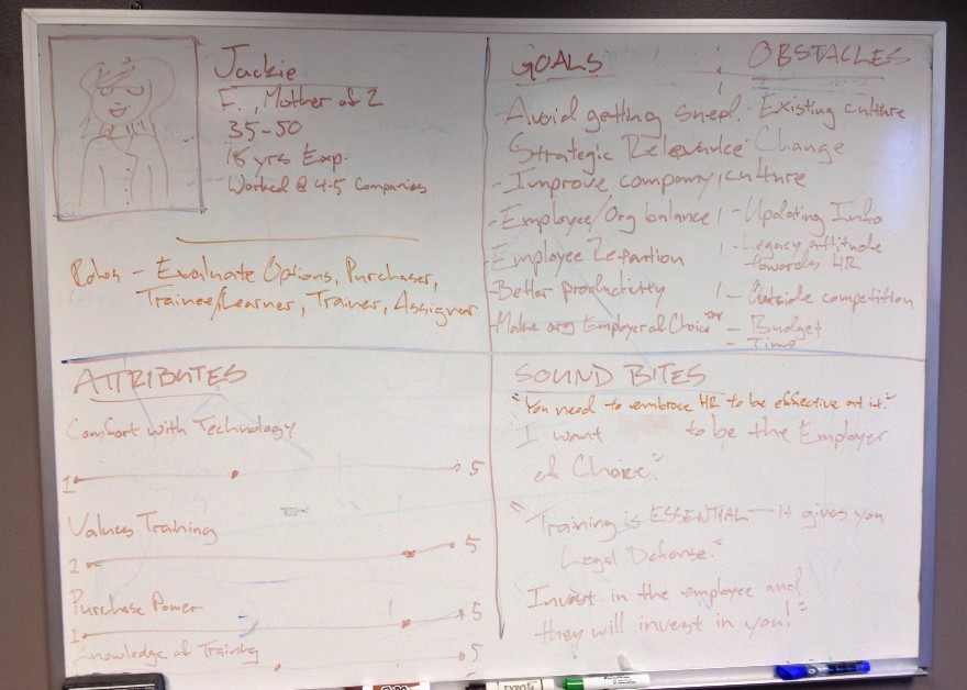
I already had available the different types of users that the organization expected to engage with our product, but they were in the form of market segmentation. This at least got me started and gave me access to data that had been collected through marketing surveys. However, what we needed for a realistic scenario to test against was a composite that was based on behavior.
When a person performs a certain task, their market segment has little to do with the way they perform that task. For example, a CEO may very likely perform a Google search in the same way a working mother might, but they are not typically considered to be in the same segment (unless, of course, the working mother is also a CEO). Behavior-based personas are a better indicator. Why? Because behavior is based on a need. Scenarios had led me to personas, but their purpose wasn’t to support scenarios. Their purpose was to understand the central context of the interaction — the users’ needs.
Knowledge Gathering
Running While Tying My Shoes
This is probably where I should mention that, while doing all of this, I was devouring as much information and training as I possibly could on user experience processes and user-centered principles. Most of it, I came to realize, were things I had always done. Research was already a big part of my design process, just not in the form of user research. User-centered translated in my mind as audience-focused — something that I had become very familiar with from working with several marketing teams. So these notions weren’t completely foreign to me. I just needed to add new tools and techniques to my existing processes.
There were several occasions where I would identify a knowledge gap in order to carry out an certain activity and would immediately have to train up on it. For example, I had become familiar with personas and scenarios a few years earlier and thought they were nice tools for creating better designs. But it wasn’t until I began trying to put together a proper usability test that I realized how they fit in with UX processes. They weren’t just nice, they were necessary. In fact, I would go as far as to say that, without personas and actual user research, the process is not truly user-centered. Same for usability testing — testing equals user feedback.
There were often moments where I would have to stop and reflect on my notes while in the midst of performing an activity. Or I would have questions that would pop up in the moment and I would have to make note and follow up that evening. Not as smooth as someone that had been formally trained in user-centered design, but the first time you do anything is always a little rough.
Agile Development = Lean UX?
When I first set foot down this path, Jeff Gothelf’s book on Lean UX had recently been published. I had already read his Smashing Magazine articles on How To Build An Agile UX Team and felt that, with our team’s transition to agile, it was a logical place to start. It helped me get a better idea of what UX’s part was in regards to agile and the development process, as well as find alignment in ideologies. It also had the additional benefit of being a cost effective approach that minimized risk, something that I would need in my pocket when I made a formal pitch to the C-suite.
I feel strongly that — within the context of my environment — Lean UX was where I needed to start. However, I would recommend a more conventional approach to someone being exposed to UX for the first time. Jared Spool, Alan Cooper, Jakob Nielsen, and many others would be a better starting point for the novice. Learn how to do proper UX before branching off into a variation like Lean or Agile. That way you understand the advantages and disadvantages between approaches.
UX, Party of One
This was, in many aspects, a lone mission. I had support from my dev team (we had long reconciled our relationships and integrated into each other’s work flow, but that’s another post) as well as tremendous support and encouragement from my boss. I would eventually get additional help from external consultants, but at the end of the day, I was only one person. Leah Buley’s UIE virtual seminar and subsequent book on the UX Team of One became indispensable resources for me.
From that, I acquired many tools and techniques that would make my work flow (and life) as a team of one much easier. Where Lean UX taught me to work on a tight budget and make the best of what I had available, Team of One taught me how to incorporate others into my process and delegate out some of the responsibilities. For example, one of the first activities that I pursued was conducting internal interviews. Not only did it help expose information about our customers and users, but it also served as internal marketing and recruitment for UX.
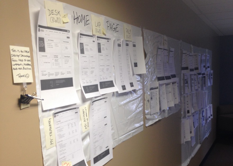
One the most useful techniques of Team of One that I adopted was the use of the sketchboard. You hang and enormous sheet of butcher paper on a wall — preferably in a well exposed, high traffic area — and post sketches of whatever project you’re currently working on. You include requirements, notes, and any other necessary information along with a kit of makers and sticky notes to allow others to contribute. I grew this technique out to include research boards for curating information about our users.
A Little Help From My Friends
As a team of one trying to build a new process, I needed help. Moral support from the dev team and political support from my boss could only get me so far. I needed a UX coach, a mentor. I reached out to several people in the community, some well-known, and did something crazy — I asked for help. And something even crazier happened — I got it.
I received advice and direction through phone calls, emails, tweets, and even in-person meetings. The amount of advice I received and the time that people were willing to spend to help out was more than I ever expected. I learned that many of the cultural and political challenges I faced were common. The overwhelming sense of camaraderie let me know that, although I may be a team of one, I wasn’t alone.
Conferences, Webinars, and Workshops
While the UX transformation was taking place in my work space, it was also gaining traction in the conference space. The 2013 D2W Conference saw an outstanding amount of talks on the topic of UX. The 2014 KCDC hosted some additional talks as well as precompiler workshops the day before the conference. I also wasn’t shy about catching the speakers after their talks, asking questions, and exchanging contact info. Aside: I should also point out that networking has always been a struggle for me, but I worked through that nervousness. You might say that UX gave me the courage that I lacked before.
Webinars were the primary source of my UX education, along with countless blog posts and articles. At D2W I was lucky enough to win a 1-year subscription to Lynda.com, helping me to learn in a slightly more structured setting. In the fall of 2013, UIE’s All You Can Learn also released their beta site, granting free 30-day access to their robust library of virtual seminars. UIE had also been gracious enough to release limited time access to their previous year’s UX Immersion recordings, where I first got exposed to the concept of Lean UX as well as aligning UX with business goals.
Conferences and webinars are great for learning theory and listening to the experience of others, but the hands-on aspect is often missing. Trying something completely new on company time is usually considered high-risk. Workshops are a great solution to this (I would highly recommend Danielle Cooley’s UX workshops to anyone starting out). Being able to apply your new skills to a real project in a low-risk environment is an invaluable part of the learning process.
Attending conferences, webinars, and workshops is also a great way to meet professional peers and grow your network (that sounds very business-y, but I approached it from a place of “Let’s be friends” rather than “Let’s do business”). I met several of my mentors this way. And it never hurts to know people who can point you in the right direction in case things don’t work out. Always have a Plan B.
Rules of Engagement
As I began to gain a little steam, I realized that it was important to lay out some ground rules for myself. They were designed for the social layer of process change, which is just as important as the process itself. Here are some things that I kept in mind as I moved along.
No Rockstars
This is something that I borrowed from Lean UX, but is definitely important as a team of one. Designers are notorious for being project heroes and full of ego. Egos are easy to trip over and can undo progress. It takes a team to delivery a project, so we’re all equally important. Getting a better experience to our users is more important than any single member.
Friends, Not Enemies
I had already experienced first-hand the frustration of company politics. It is unfortunate that there are people in the world that are threatened by the success of others, but it is something to be aware of. That said, is important to always be gracious and thank people for their time and effort. It is okay to disagree with someone, but don’t make it personal. Choose your battles wisely. Sometimes, it is more important to give in now so you can gain support for the future. Lose the battle, win the war.
Don’t Gossip or Slander
This may seem obvious, but it can be a challenge. One of the many ways that people connect with each other is by sharing stories. These connections are important when UX goals rely on internal support. Often when people share stories, it comes in the form of gossip. It’s okay to listen, but try to keep it to a minimum and avoid contributing. If you want people to lend you their trust — and it is on loan — then you have to show you won’t abuse it. This is especially important for conducting internal interviews as well as garnering support for your cause.
Evangelize
This one is challenging as you have to always “be on,” which can be exhausting. It can also easily be overdone, so be careful about how much you bang the UX drum. Squeaky wheels may get the oil, but sometimes they just get replaced. Try to find relevant ways to pull UX into the conversation. Listen to problem areas that your co-workers have and think about where UX can help. If you have a success, celebrate it and everyone involved.
Recruit
Asking for help is a good way to recruit others and explain what it is that you are trying to do. If you make it relevant to their context, you’d be surprise how helpful others can be. The best way to spread the word is by reaching across departments for support. This allows you to delegate out some of the UX activities — alleviating some of the pressures as a team of one — while gaining buy-in across the organization.
Openness & Transparency
This falls in line with evangelization and recruitment. Be open and let others into your process. Take ownership in what you do, but don’t lock others out. Design is and always has been a collaborative process, so embrace it. No more designing in black boxes. You are still the expert, so demonstrate your expertise by facilitating and empowering others. Let everyone see what you’re doing. Celebrate the contributions of others. Secrets don’t make friends and closed mouths don’t get fed.
Constant Curation
This is an extension of openness and transparency, as well as evangelization. Make your process public. Use sketchboards, posters, wikis, emails, IM, and whatever else to make your efforts and findings visible and accessible to all. Evangelize UX by synthesizing the knowledge to the collective. You’re not doing all this for your sake, you’re doing it for the sake of the product and the company at large.
Be User Friendly
Treat yourself like a digital product and be as user friendly as possible. If you expect people to pitch in, it needs to be as convenient for them as possible. Change is hard and people are often resistant. Offset this resistance by making it easy. This means additional work on your end and — I warn you now — it is tiresome. But its not a burden you will have to bear for long. And if you do (you’ll have to determine what is an acceptable time scale), that may be an indication that you’re doing something wrong. It may also be an indication that your organization is not ready for UX. If the latter is the case, be prepared to set sail.
Function Over Form
Not something that you’ll hear me say very often, but function is more important than form here. If you are lucky enough to gain traction and get active participation from others, run with it! So what if they aren’t doing it “right”? You can adjust the way it’s being done after people see the value and begin trusting the process. Criticizing too early may shun (and potentially lose) supporters.
Design With the Grain, Not Against It
This is part of a larger concept that I refer to as The UX of UX. That means running the UX process on the UX process and getting to know your users just like you would for a product. You are the interface between the stakeholders and the process. Knowing who they are, what they do, what their needs and pain points are, and how the process affects them is important. Profiles for your internal users — or internal personas — can be a tremendously helpful tool.
Think about the organizational context and design a process with existing processes in mind. If your process causes heartburn for everyone involved, you will be hard pressed for support. Being aware of any potential conflicts and designing for them will soften the change.
It might be helpful to create an experience map of your organization much like you would for a product or service. This will help you to better understand how all the pieces come together. It doesn’t have to be fully realized in order to be useful, just enough for you to start to get the bigger picture. Treat it like a living document — as more information becomes available, iterate (this is Lean thinking coming into play).
The process wouldn’t be complete without its own feedback cycle. Leave the door open for critique or suggestions. Ask for feedback at the end of project phases or UX activities. Stop by desks or offices and do impromptu check-ins. This not only gathers insights, it also builds relationships and helps maintain visibility. Remember: out of sight, out of mind.
Formalizing the Process
Most of the powering up took place in the latter half of 2013. At my annual review in July of that year, my manager and I decided to evolve my role more towards UX. We also hoped it would better define roles within the organization and create clearer expectations for project management.
User Research
By the beginning of 2014, I was setting up appointments with customer-facing departments and conducting internal interviews. After each session, I posted my notes in the company wiki. I kept two versions of the notes: one a raw transcript (for my eyes only) and the other edited down to session dates and key insights that was accessible across the organization. Confidentiality was something of a concern, so names and departments were omitted.
I also leveraged the existing data from marketing surveys in order to minimize effort and accelerate discovery. My goal was to get all of the necessary information collected up front for persona creation workshops. The intended invitees would have limited availability, so convenience and efficiency were major factors for maximum output. The collaborative workshops would aid in establishing a shared understanding as well as collective ownership of the process.
Usability Tests
I scouted around a bit for testing facilities. We originally wanted to run moderated tests in-person. After getting the first round of budget proposals from various vendors, we realized that getting executive approval (it was relatively expensive) would be extremely difficult. As an alternative, we set up tests with UserTesting.com, which allows for recorded remote testing. It was much more cost effective and provided telling results. We hoped it would get the decision makers excited enough about usability testing to grant a larger budget.
The Pitch
After almost a year of training, research, and process development, we were finally in a position to make a formal pitch to the new CTO (during all this, the former CTO had retired). Serendipity struck in the form of a Customer Experience consultant, who started just two days before our meeting was scheduled. We quickly reworked the slide deck as a joint effort for maximum appeal. The CTO gave us executive approval, formalizing the UX process.
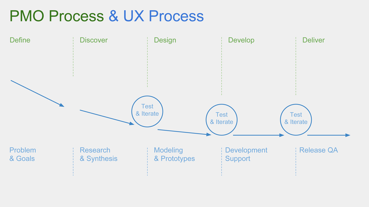
At my 2014 annual review, my job title was changed from Interactive Design Lead to User Interface & Experience Design Lead, incorporating the full scope of the UX process into my list of responsibilities. A few weeks later, a joint meeting was held to redefine the boundaries between departments and job roles, further crystalizing our efforts. It was a success all around.
External Contributors
Customer Experience Consultant
Right when things were really starting to come together, outside consultants started getting involved. The contracting of the Customer Experience consultant ended up being a shot in the arm. He had access to leadership that I didn’t previously have. He also sat outside the org chart, which meant he wasn’t subject to the same political dynamics. The added boon of being like minds translated into a shorter ramp up for joint strategies.
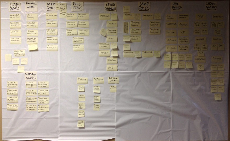
Together, we ran the collaborative workshops and recruited others into our efforts. As an important part of this process, all artifacts were curated openly as research boards in the office hallways. This helped to expose those who didn’t attend to the process and allowed them to contribute additional insights (extra note pads and sharpies were kept nearby). As the sessions moved on, research boards were consolidated and eventually evolved into personas and touchpoints. We needed everyone to see the process as it happened as well as be able to easily digest the findings.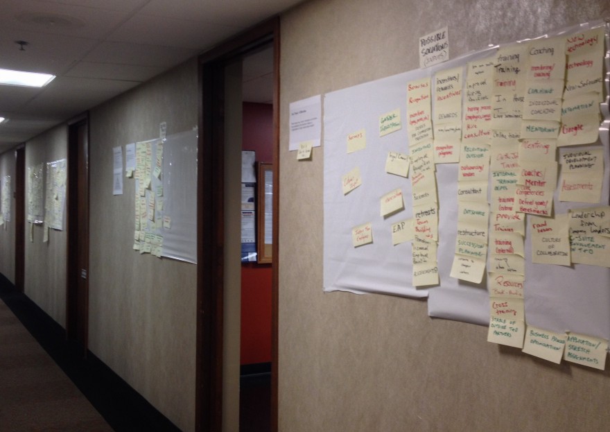
Sales Consultants
Right about the time the collaborative workshops began gaining momentum (I was now frequently getting stopped in hallway by excited attendees), another third-party vendor came into the picture. They were a national (international?) brand with plenty of weight behind their name, so in many ways, it was an additional boost. The goals of the CX consultant and I were echoed by their expert advice.
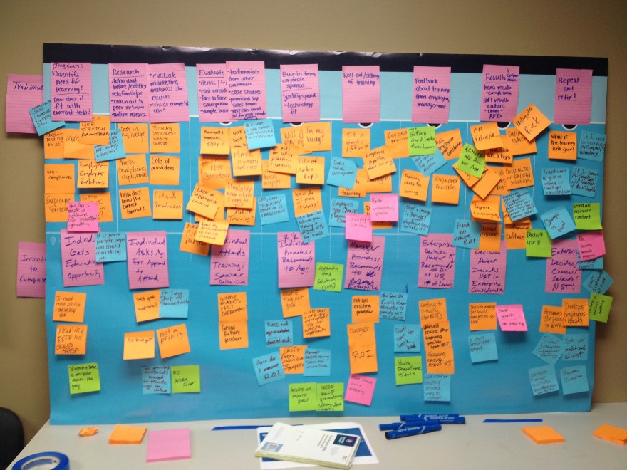
Piggy-backing off of our efforts, the vendor ran a day-long collaborative workshop fleshing out the remaining personas, their journey maps, and possible solutions for the future version of the application I worked on (a full redesign was now in talks). Much of our work was validated by their process as well as giving the culture a much needed shock of intense collaboration. The additional output pushed our efforts even further and the similarity between processes proved to the business leaders that we knew what we were doing.
UX Consultants
On the heels of the day-long workshop, a local vendor, who specialized in UX consulting, began contracting with the organization. Validating our efforts even further, we collaborated together in a month-long discovery phase of what was now an official redesign of the application. I give them kudos for the extra care they took to work with the in-house team and keep the spirit of collaboration a high priority. Our joint efforts produced a detailed competitive analysis (yay, spreadsheets!), a more holistic look at the user-product ecosystem, and additional recommendations on the evolution of our product and services.
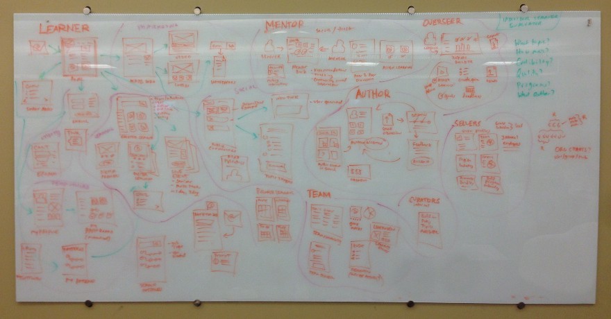
Where there was plenty of room to compete with and contradict each other, the experience with the consultants and vendors was very productive. It was a fortunate outcome that the efforts of one supported and legitimized the efforts of the other. User experience was gaining traction and the corporate culture was beginning to shift as a result.
Successes
Evolving a Role
It took quite a bit of effort and dedication, but redefining a role within a hostile environment is nothing to snicker at. Instead of giving up and succumbing to frustration or apathy, with the support of my boss and many others, we were able to grow my role into something more. This is something that the organization needed, whether they knew it or not. It was a golden opportunity and I am glad to have seized it.
Executive Approval
I honestly didn’t think we would get approval from the C-suite, but we made it happen. It was the joint efforts that influenced the final outcome, and I am grateful for all the help I received along the way. As anyone who has had to convince a client will know, getting buy-in from the key decision makers is no small feat.
Cultural Change
Getting buy-in from leadership should be the crowning achievement of this story, but it’s not. It’s the cultural change, the transformation in attitude that I began to see. Hearing the stakeholders refer to personas by name in project meetings was magical. Seeing the excitement around the collaborative workshops was empowering and inspired me to keep moving forward. The biggest thing I learned was, even though it may not seem like it, people are willing to contribute. The silos that had separated everyone for nearly 30 years were beginning to crumble and people were clawing at the bricks. The power of UX isn’t just the ability to provide a better designed product, but the effect it has on the organization overall.
Failures
As much of the UX process was something I grew into, it was not without its own missteps and failures. But that’s something to be celebrated. Just like in usability testing, it’s the mistakes that give you the most information about the quality of a design. Without the failures, I couldn’t have the successes.
Establish Benchmarks
One of my biggest shortcomings was not having the experience nor the foresight to establish benchmarks to measure against. I can tell you that the application I worked on grew in subscription rates, renewal rates, and contribution to the company’s overall revenue stream. I can also tell you that customer service calls on usability issues dropped significantly. What I can’t tell you is what those numbers were before I was hired. That is important if you are trying to prove the value of your role (and department) to the decision makers.
Identify Key Stakeholders
As we are all in the people business, it is important to identify not only who’s involved in a project, but anyone that your job role may affect. Being more mindful of the Creative Director’s perspective on the application and the job responsibilities therein may have saved me a lot of heartache and frustration. Many of the stakeholder relationships I stumbled upon during the commencement of a project. That is something I would highly recommend identifying before even discussing requirements. It’s the people that make the project work, not the requirements.
Leadership
I do not come from a background in Business Administration, so much of the corporate layer I had to learn in the process. UX as a job function — and they don’t tell you this part — is indeed a leadership role. It has to be. If you are going to truly influence the stakeholders and incite organizational change, it requires leadership skills. That doesn’t mean being in a formal leadership position, but it does mean being a leader. I didn’t understand this walking in, but I definitely get it now.
Day Late, Dollar Short
I am not the most assertive person by nature. There have been times in my life where I could see an opportunity, but fail to seize the moment. Much of what I set out to do would have been more effective had I acted sooner. What I was able to accomplish is something to be proud of, but there could have been more.
End of the Saga
How does the story end? I was laid off with many others from my department (including my boss). Maybe not so unexpected because one could sense that a storm was brewing. But unexpected considering the amount of success and momentum the UX process was gaining. You can’t win every fight. You can’t change people who don’t want to be changed. Sometimes winning really means recognizing when you’ve lost. My take away from all this: Have the courage to battle giants, but have the wisdom to walk away when it’s a battle that can’t be won.
UX as a role is in high demand right now. If it is something that you are passionate about, there is no need to stay at an organization that doesn’t support it. There are others that will and pay well for it.
I came into UX as a response to adverse conditions, but it is something that I’ve grown to love. And in a sense, I’ve been doing it all along. Ever onward.
Acknowledgements
I would like to extend thanks to the following people:
Patrick Neeman for encouraging me to embrace research and testing, resulting in a more formal UX role. Jon Kohrs for being a coach and mentor, helping me with political strategy and process. Dave Hogue for the excellent talks on the psychology of UX and advice on the internal struggles. Danielle Cooley for the invaluable workshops, mentoring on process, and strategies for making a business case. Steven Hoober for the advice on testing labs, moral support, and calling me out whenever my thinking was flawed. Kate Caldwell for teaching me to treat personas with care. And an extra special thanks to Chris Butler and Elias Jones for being brothers-in-arms every step of the way.
Without your advice and support, I wouldn’t have accomplished half of what I did. This post is my way of paying it forward.
Cheers!
