ICYMI: Samsung iTest
Catching up on my emails this week (I subscribe to way too many tech newsletters), I came across this curious little piece at the tail-end of Dave Verwer's iOS Dev Weekly - Issue 502. A link vaguely titled "Welcome to the other side…" met with an inquiring mind and I couldn't help but to click. What I found was something beyond what I was expecting…
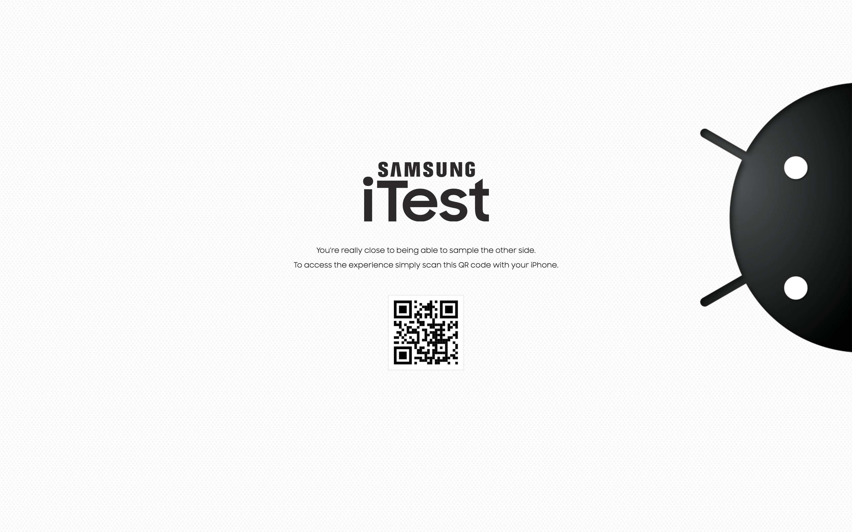
…now, before you go clicking the link yourself, I will warn that it requires a leap of faith. First, know that I would never willingly send you to a website that has some murky stuff going on. After you scan the QR code, you will be taken to a mobile site where you will effectively download an app outside of the App Store (which admittedly made me raise a suspicious eyebrow). Not to worry, although a little unorthodox, it is totally above board.
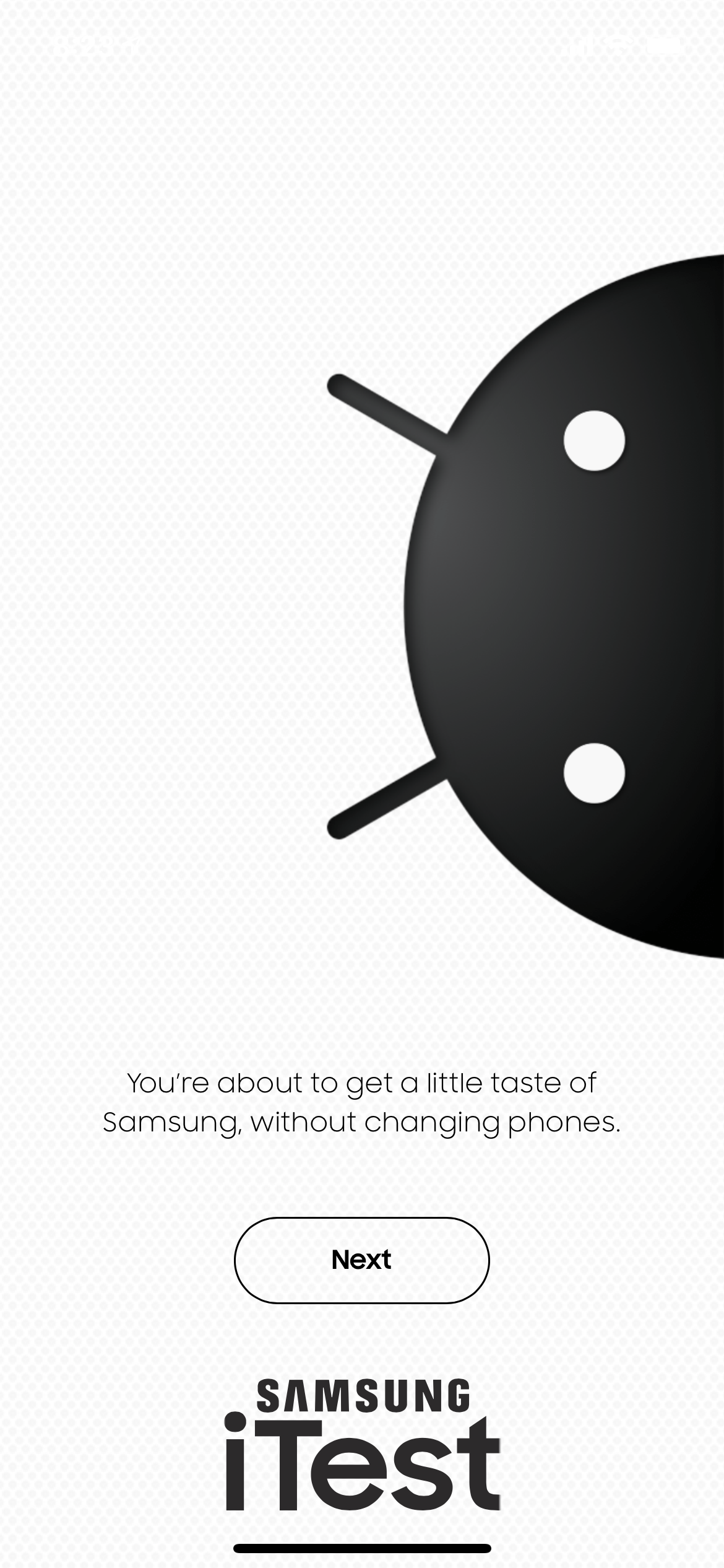
One other thing: the target audience here are the iPhone users (like myself). If you're already on a Samsung phone, you won't get much out of it (though I haven't tried it on a non-Samsung Android phone yet).
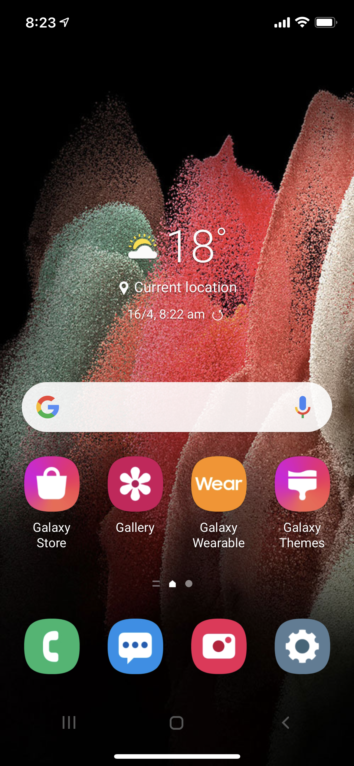
As someone how has dedicated his professional life to studying mobile UI and IxD, I have to say, this is pretty damn convincing. Although I don't own a Samsung phone per se, I do, however, own a Samsung Tab A, which is very similar in appearance and interactions. And, well, they nailed it! So much so, that I found myself disoriented at times, forgetting I was actually on my iPhone (12 Pro, if you must know).
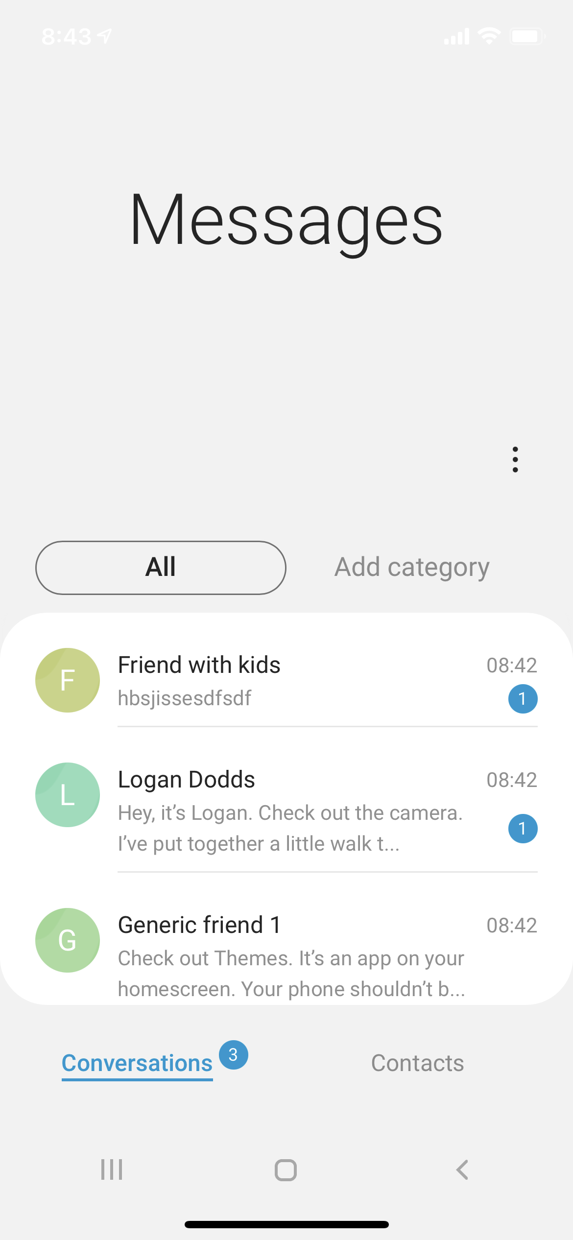
What's impressive is most of the apps, although fake, launch and even go a couple of levels into the navigation stack. You start receiving messages — including alert sounds — almost immediately inside the experience, complete with ongoing conversations including some erroneous photos sent from a child playing with their parents phone!
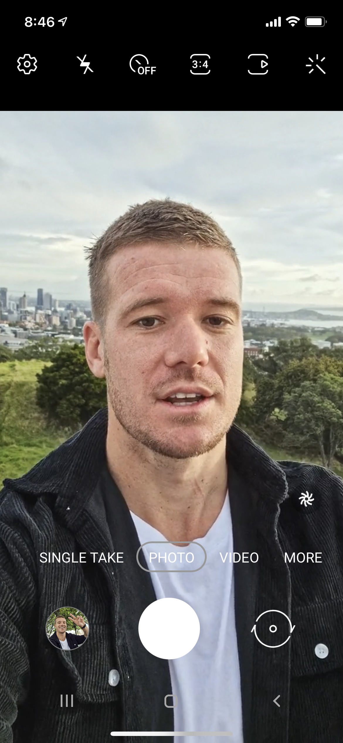
The camera app is guided by a video tour where the host points (correctly) to the various features on the screen. This continues on throughout the various camera modes (photo, video, more) before concluding with a final "…and hope to see you on the other side." Naturally the camera app itself doesn't work, but it's enough to get the prospective convert excited!
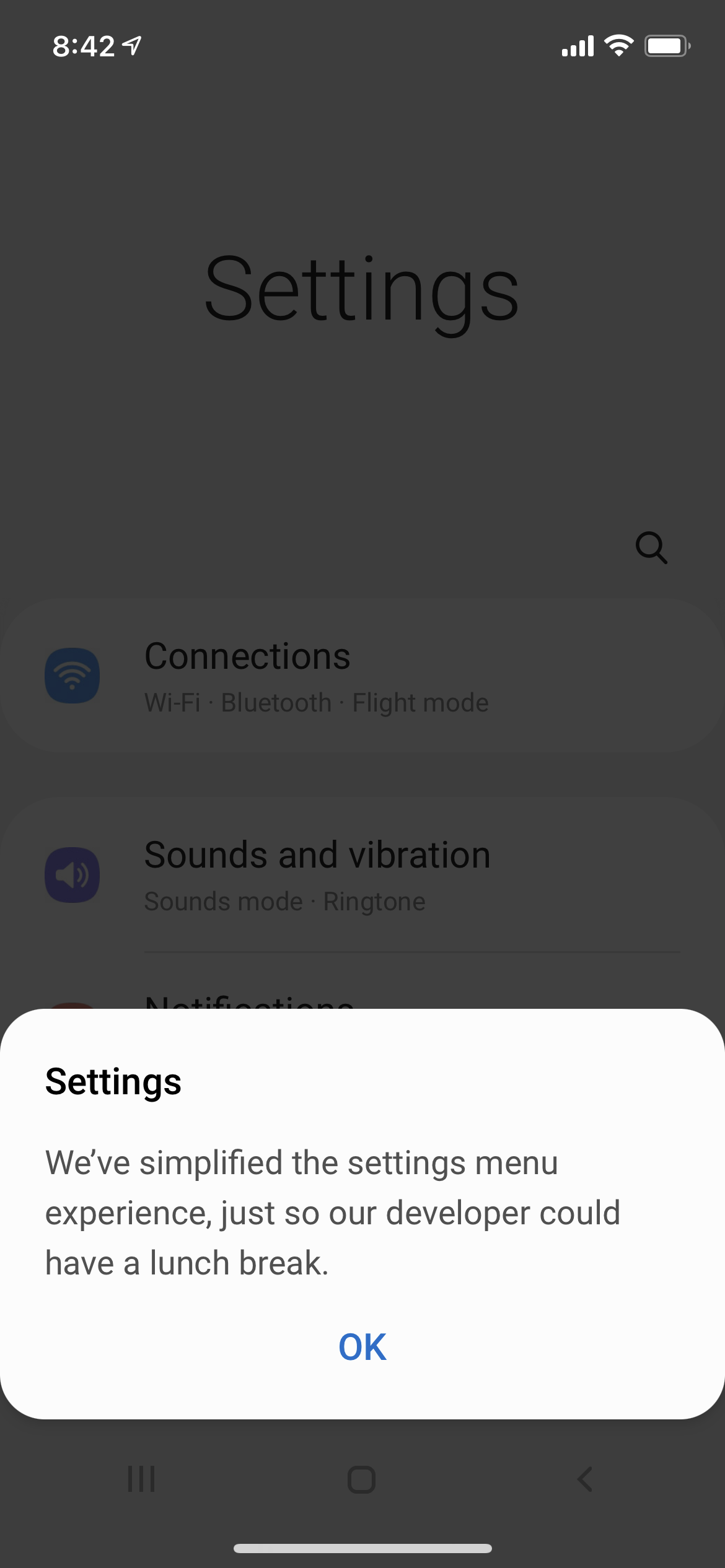
I don't want to give too much away, so I've intentionally left out some of the other details. But it's definitely worth the time spent poking around and letting them try to convince you to switch. The experience is thoughtful, the copy is humorous, and clearly they paid attention to all the special details. And of course, no sales pitch would be complete without a mock Smart Switch app.
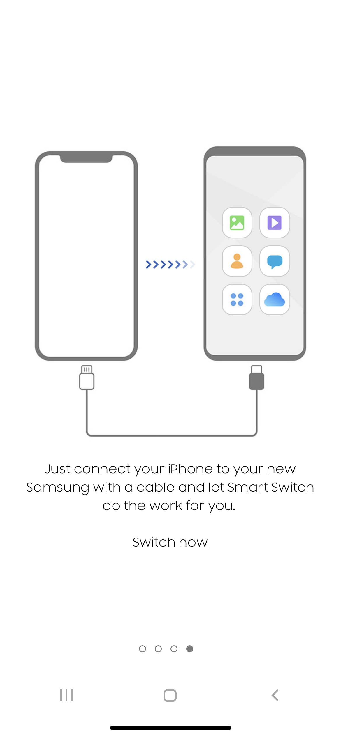
All in all, it's a very well done marketing ploy that couldn't have been achieved without the help of attentive user centered design and solid app development. Hats off to the team that pulled this off!
