ICYMI: Mobile & Emerging Tech; 36:2021
Week 36

Series 7. Predictably, in anticipation of this year's Apple Event, the leaks from fairly reliable sources have started their trickle. What might we expect from the likely announcement of the Apple Watch Series 7? Flatter edges, bigger display, and new sensors to name a few. And with it, we should expect to see new watch faces, complications, and apps on the software side.
iPhone 13. Still cranking the Apple rumor mill, the iPhone 13 will reportedly allow calls and text via satellite when cellular is unavailable. I can see the utility, especially in emergency situations (the image of being stranded on the side of the road somewhere in rural America comes to mind). But it still feels a bit like wow-factor, at least at first glance. Then again, there's a lot that goes into making it work for it to be just for show, so we shall see.
Windows 11… will launch without Android app support. That's unfortunate because it is probably the feature of the new OS that I was most excited about. I was really looking forward to testing it out on display models in the store, especially on multi-touch devices. Does it feel fully native or does it run more like an emulator? Is there any latency on touch events? Are all the gestures there the same as they would be on a native Android device?
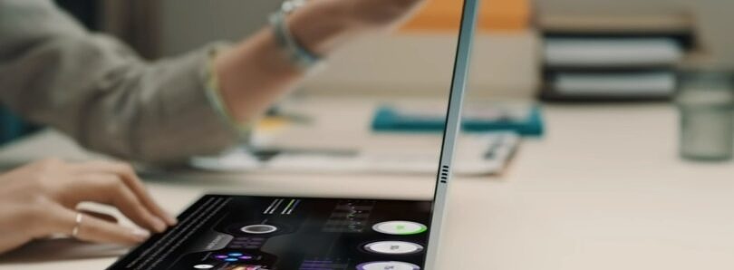
Galaxy Book Fold. You read that right. Galaxy. Book. Fold. As in, a foldable display laptop. No, it's technically not mobile, but it's mobile-ish. And I'm so enamored with foldable displays right now that I couldn't not mention it. Check out the video included in the article and you'll see why.
Mobile History. If you've been around as long as I have, you definitely remember the arrival of smartphones. For those of us who lived it, this piece is a nice little stroll down memory lane. For the younger readers, it's the short version of the events that made the world that we live in possible. And if you work in mobile, consider it a must-read.
From the desk of…
As a pattern, this is commonly referred to as a "master-detail" or "list/detail" and it is not unique to tablet interfaces. In fact, the more you study tablet apps, the more you begin to realize that many of the patterns are borrowed from native desktop applications, but optimized for touch and gestures. You'll also begin to realize that, from a HIG and Material Design perspective, the documentation is often… lacking. And that's the world I currently live in.
P.S. As I was typing out this issue, the official date and time for the Apple Event dropped. September 14th at 12pm CDT. Mark you calendar.
Articles
- Apple Watch Series 7: Features, release date, new design, more via 9to5Mac
- Kuo: iPhone 13 to Feature LEO Satellite Communications to Make Calls and Texts Without Cellular Coverage via MacRumors
- Windows 11 won’t include Android app support at launch via The Verge
- The Galaxy Book Fold may be Samsung’s first laptop with a foldable display via XDA
- And then there were smartphones via Increment
Events
- [Sep 14 @ 12pm CDT] Apple Event via Apple
- [Sep 14–15] Works With Conference via Silicon Labs
- [Sep 15 @ 11am CDT] Connect the dots: Effective project kickoffs via InVision
Resources
- [Report] Offer Relevant Autocomplete Suggestions for Closely Misspelled Search Terms and Queries via Baymard Institute
- [Report] The Mobile Playbook for the Finance Industry via Branch
- [Guide] How Mobile Helps Simplify Your Digital Transformation via Vibes
- [Guide] What Is User Onboarding? Examples, Best Practices & Mistakes to Avoid via Product Collective
