ICYMI: Mobile & Emerging Tech; 39:2021
Week 39

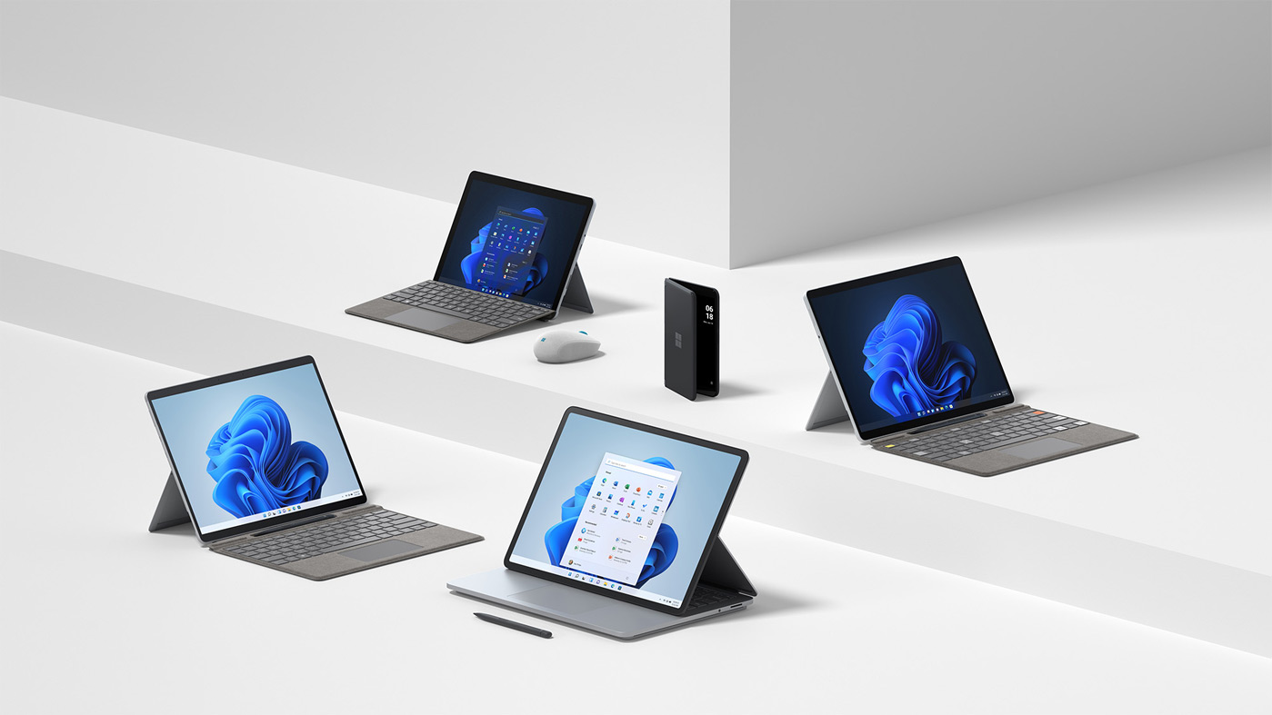
Microsoft Event Recap. Out of everything that was announced at the Microsoft Event last week, the most notable are probably the Surface Duo, the Surface Pro, and the Surface Laptop. With Windows 11 and its mobile considerations, I would actually consider buying* a Windows machine (*provided it delivers as promised). And if I'm being completely honest, the flexibility that the Surface Pro offers is exactly what I'm looking for… I just need it to be Apple, because ecosystems.
iOS 15… (along with iPadOS, watchOS 8, and tvOS 15) also rolled out last week. With so many new features, some, like changing Safari's address bar and inline translation, may not be as obvious as others. And even Google's apps were updated to support Focus Mode and iPad widgets. But I'm probably happiest with them bringing back the magnifying glass for text selection.
Android Updates. While all eyes have been on Microsoft and Apple, Google reminds us that we don't have to wait till Android 12 to get some of the new features coming out this fall. Accessibility features like Camera Switches and Project Activate should have started rolling out last week. While other features like Locked Folder and Heads Up were already available for Pixels, but will now be rolling out to the rest of Android. And now I'm reminded I need to spend more time carrying my Pixel 4a around.
Super PayPal. We revisit the term "super app" with the launch of PayPal's newest iteration. With the combining of features like payments, savings, and bill pay into a single app, they are walking a fine line between too much and just enough. As mobile matures, it's interesting to watch products struggle with the same issues of feature bloat as their desktop relatives. It will also be interesting to see if they don't inevitably break them back up again.
Google Pixel. And we might get a surprise Pixel Fold announcement at the official launch for the Pixel 6. If this proves true, and everyone's bring foldables to the party, then it will beg the question: Where you at, Apple?
From the desk of…
I'm taking a slight detour this week to share this article from Fast Company on MTA’s Live Subway Map. Why? Because 1) Massimo Vignelli and 2) maps are hard. Especially interactive maps with multiple layers of data. Add in real-time updates and that is a very enticing problem to solve. Oh, and did I mention that it's a cross-platform app? Phone, tablet, web, touch, click!
The designs are elegant and faithful to the original Vignelli designs, but what I admire most is the philosophy that, if the system is running as intended, you shouldn't need to use the map at all. It's a mind-shift to design and develop a product that, while you still want it to be usable and enjoyable, you hope the necessity isn't there. That's a different perspective from the way many of us approach our products, often with acquisition, engagement, and retention in mind.
Articles
- First impressions: Everything Microsoft announced at its 2021 Surface event via TNW
- iOS 15 is now available via Engadget
- New Android features coming this season via The Keyword (Google)
- PayPal launches its ‘super app’ combining payments, savings, bill pay, crypto, shopping and more via TechCrunch
- Google Pixel Fold might steal the show from the Pixel 6 and Pixel 6 Pro via Digital Trends
Events
- [Sep 30 @ 4pm CDT] Marketing strategies for subscription based apps via Adjust x Twigeo
- [Oct 4-8] Apprising Fall 2021 - Mobilizing Digital Growth via Poq
Resources
- [Library] ReallyGoodUX via Appcues
- [Trends] Apps to reach record highs in Q3 of 36B downloads and $34B in consumer spending via TechCrunch
