ICYMI: Mobile & Emerging Tech; 43:2021
Week 43

Unleashed Recap. HomePod mini colors, AirPods 3, MacBook Pro, and the M1 chips pretty much sum it up. Okay, so not a whole lot of mobile in this one. None, actually. But we did get a Voice (-only) Plan for Apple Music, which, from a user journey & product ecosystem perspective, is an interesting move (especially since I don't personally have the best of luck calling up songs through Siri re: bilingual).
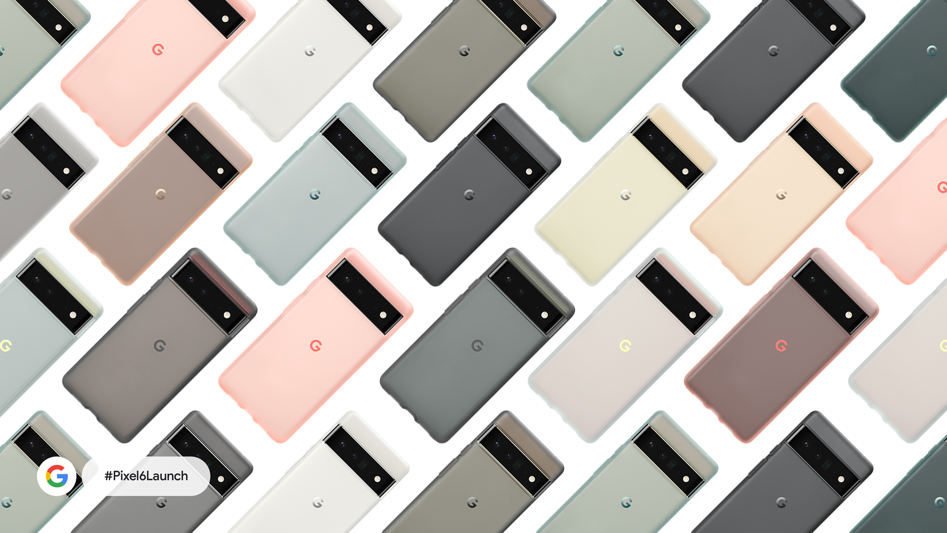
Pixel Recap. And Pixel 6 Pro camera, the Tensor chip, Translate, and Real Tone pretty much sum up the Pixel 6 Launch. The major theme of the event was the power of AI (which makes a lot of sense seeings how Google has all the data). And how on-device processing is made possible by the Google-made Tensor chip, showcased best by the "live" Translate demo with Marie Kondo (yes, that Marie Kondo).
Unpacked Recap. If I had to distill Samsung Unpacked Part 2 down to one word, it would be personalization. Bespoke design, designer editions, One UI 4 (re: Material You), and the Samsung ecosystem were the main focus of the event. And as someone who lives life on the software side, I'm really interested in taking a deep dive into One UI 4 in particular (maybe I'll set my Tab A up on the beta).
Android Summit. The way I'm approaching the Android Summit is the same way I approach Apple's annual WWDC. The primary audience are developers, but there is plenty for UX and Product folx to learn as well. At the very least, it's worth taking a gander at the agenda and attending the keynote. This starts tomorrow, by the way.
Apple Talks. And speaking of Apple developers, new virtual Tech Talk sessions were announced last week. As I mentioned above, I would look past developers being the primary audience and attend some of the sessions anyway. I've learned a ton in my career as a designer from attending sessions like these because it helps me to better understand the technologies that we work with. Consider it another tool in the box for making product recommendations.
From the desk of…
If you're on (or have) a Google Pixel, you may have noticed that the public version of Android 12 also rolled out last week. I just installed it last Thursday evening myself, but have been just busy enough to not have had much of a chance to play with it yet. As I'm out on PTO for the next few days, I'm hoping to spend a little more quality time with it and get to know the updates a little better.
Going off of what I've experienced so far, I'm seeing Notifications with much more rounded corners and a revamped Quick Settings with larger controls. The typographical hierarchy, most notable in the Settings app, has also been punched up quite a bit. And then, of course, there's the much anticipated Material You. As I have the stock "4a" wallpaper installed on my home screen, I'm not seeing a huge difference with the variable color palette. But then again, I'm boring like that.
I'll continue updating as I get more acquainted with Android 12.
Articles
- Here’s everything Apple announced at its ‘Unleashed’ event this morning via TechCrunch
- Here's everything Google announced at its Pixel 6 event via Engadget
- Samsung Galaxy Unpacked Part 2: Everything announced at the October 20 event via Digital Trends
- Google’s brand new Android 12 operating system launches today via TechCrunch
- Apple introduces Tech Talks 2021, live online sessions for developers via Apple Newsroom
Events
- [Oct 27-28] Android Dev Summit 2021 via Android Developers
- [Oct 28 @ 12:00pm CDT] Alexa is on-the-go, your skills should be too via Amazon Alexa
- [Nov 10 @ 11:30am CDT] Firebase Summit 2021 via Google
- [Nov 15–19] MAU Connect 2021 via Quartz Events
Resources
- [Video] Apple Unleashed Replay via Apple
- [Video] Pixel Fall Launch Replay via Google
- [Video] Galaxy Unpacked Part 2 Replay via Samsung (YouTube)
- [Video] How Conversational AI is Revolutionizing E-Commerce via Voice Talks
