ICYMI: Mobile & Beyond; 43:2022
Week 43

ADS22. The agenda for this year’s Android Developer Summit dropped last week. You can check out the live steam schedule, technical talks, and speakers — and it starts today! Even though it’s developer focused, Material Design and Android 12L was discussed in detail at last year’s event, so worth the look. The announcement of dates was actually back on October 5 and I just completely missed it. My bad.
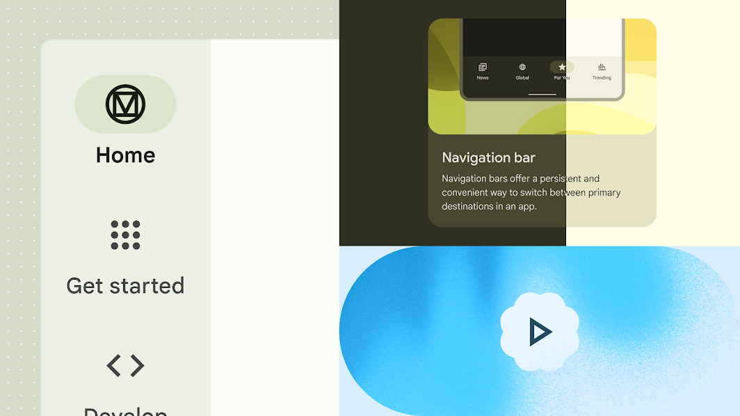
MD3 Update. Speaking of Material Design, a massive update for the MD3 site also went live! The new documentation site includes guidelines on dynamic color, animation, and typography. But probably the biggest change that you’ll notice is the updated and consolidated components guidelines, which previously spanned across all three versions. Also, if you had any of the old docs bookmarked, be prepared for those links to redirect to MD3 now.
Google Widgets. In other Google-related news, more widgets for iOS 16 rolled out. Gmail, Maps, and Search are the latest apps to gain access to your iPhone’s Lock Screen, as well as a handful of others. In one of the more interesting features, voice search promises to find names of songs by literally humming a few bars! It’s really interesting to see the convergence of Apple and Google products across devices.
New iPads. In a press release, Apple announced the redesign of the base iPad. Available in four new colors, the updated design bids farewell to the the home button, maximizing the screen real estate, and increases performance with the A14 Bionic chip. The company also announced the release of the M2 iPad Pro, which will ship with iPadOS 16 (due to be out later today, along with iOS 16.1). Hopefully they finally got Stage Manager sorted (and how usable it is on my iPad Mini).
Moto-rollable. Motorola announced a new rollable concept phone at Lenovo Tech World. With the press of a button, the screen grows to 6.5 inches or shrinks to 5 inches for compact storage when not in use. It’s no secret that I’m a sucker for bleeding edge features, and this break in form factor — although not the first — is no exception. Although I’m struggling with a practical use case, I applaud the innovation — you never know what new ideas it could inspire.
From the desk of…
I wanted to follow-up on the One UI 5 announcement at SDC22 from the previous week. I admittedly glazed over it in last week’s issue for the sake of brevity, but given how this is a dispatch focused on mobile, it felt like something that deserved more thought.
At a glance, Samsung has refreshed the look & feel of One UI 5, which is built on top of Android 13. The company has clearly taken steps to shrink the release gap — a drawback of OEM skins. Like Google’s Material You, the updated mobile OS leans into personalization, offering video wallpaper, clock styles, and stacked widgets for a custom experience. Widgets may also be suggested by the system based on usage patterns and mobile activity.
Aside from updates at the UI layer, there is increased focus on privacy and security. One UI offers privacy dashboards to help identify and manage potential security threats at a glance. The system will also warn you if you are unintentionally about to share personal information via the Share Panel. Again, we’re seeing feature parity across the competing platforms — which I think is a good thing!
Articles
- Get ready for Android Dev Summit ‘22 (Android Developers Blog)
- Magic, utility, and redesigning Material.io (Material Design Blog)
- Add these new Google widgets to your iPhone (The Keyword)
- Apple unveils completely redesigned iPad in four vibrant colors (Apple Newsroom)
- Motorola's Rollable Phone Concept Changes Size With the Press of a Button (CNET)
Events
- [Oct 24 @ 11am CDT] Android Dev Summit ’22 (Android Developers)
Resources
- [Guidelines] Empty States in Application Design (NN/g)
- [Tutorial] Understanding User Pathways in Analytics (NN/g)
- [Videos] Microsoft Ignite: Session Catalog (Microsoft)
- [Report] This Week in Apps #136 - What a Mess! (Appfigures)
