ICYMI: Mobile & Beyond; 45:2022
Week 45

Twitter. Right into the drama, Elon Musk wants to charge users for verified account. That’s right, the coveted blue checkmark now comes with a $20/mo price tag in an attempt to move away from ad-based revenue. There is also murmuring that the Chief Twit wants to resurrect Vine. But considering he also dissolved the board and laid off 50% of staff, not sure how he expects to pull that off. That price tag has since been lowered to $8/mo.
Instagram. In other social media news, some accounts appeared banned due to an Instagram outage. Affected users had issues accessing their accounts with some receiving notices they had been suspended while others observed a drop in their follower counts. Instagram’s parent company, Meta, later issued a statement saying the issue was due to a bug and had since been resolved. That’s two social app fires in the same week!
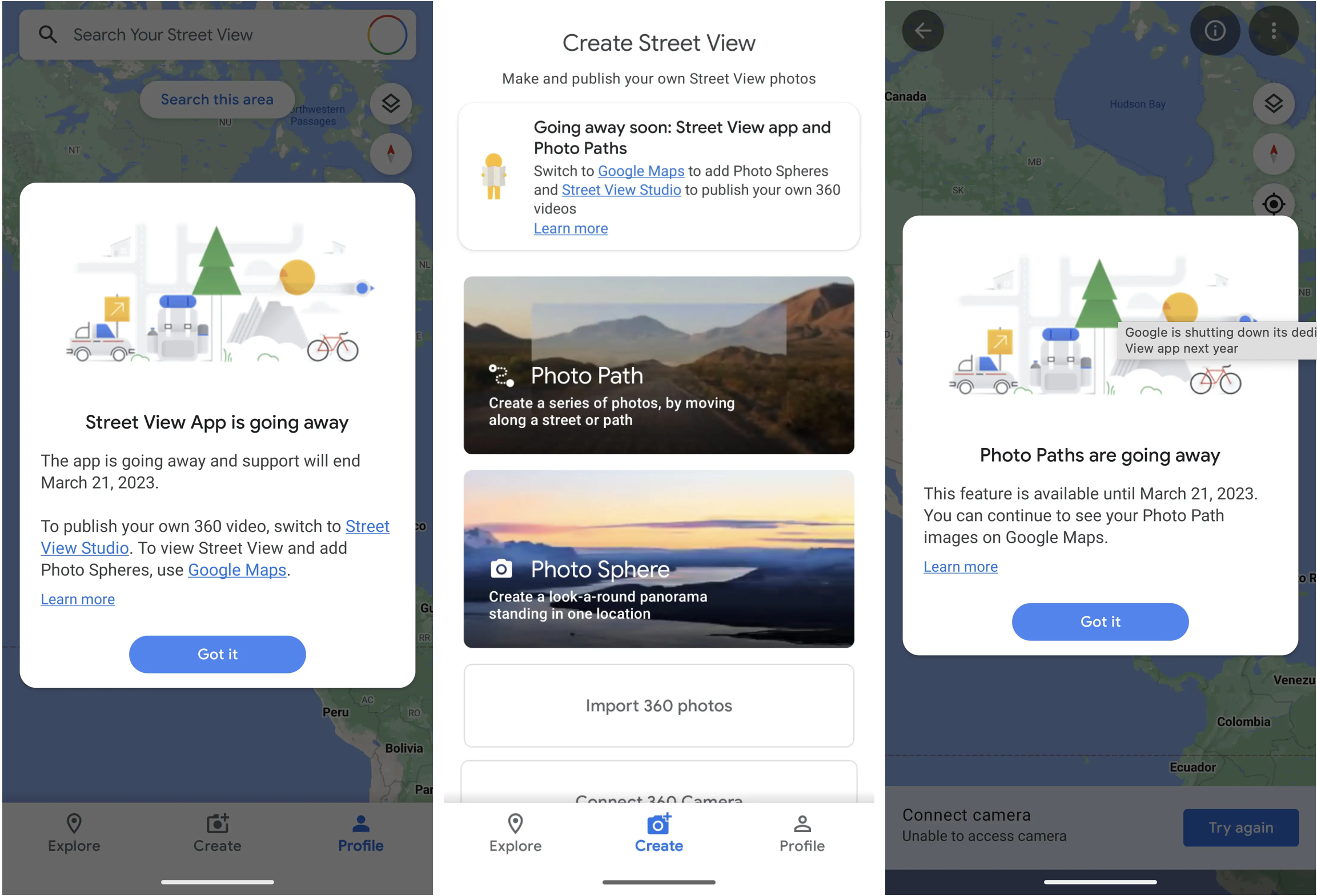
Street View. Google will be shuttering their Street View app next year. Specifically, the dedicated standalone app for both iOS and Android will be going away in favor of the same feature available in Google Maps. What might be missed, however, is Photo Paths which is currently not a redundant feature in Maps. That said, the decision is probably not surprising and I’m sure the usage numbers weren’t high enough to justify the cost of the supporting team.
One UI 5. Here’s a slightly biased review of Samsung’s One UI 5. From customization to new features, the authors provide a fairly thorough walk-thru of the updates complete with screenshots. If you don’t own a Samsung device, it’s a nice peak into the operating system and how it differs from “pure” Android 13. And although the shipping date was an improvement, I wish they could tighten up their release sequencing with Android proper a bit more.
Mobile + Bridges. Smartphones could be used to monitor the safety of bridges. A method developed by university researchers would use accelerometer data collected from phones in cars that travel over bridges. The idea is that the phones detect the vibrations from the structures and, over time, pick up on any changes. Although it’s no replacement for an inspection by an engineer, this is the type of unexpected technology solution I love to see!
From the desk of…
As part of the visual design explorations that I mentioned last week, I did some investigation into Material Design 3 — which I had wanted to do a deep dive on since its launch. More specifically, I geeked out on the color guidelines which have changed quite a bit (and I was admittedly rusty on). There's also this post from the Material Design blog that gets even deeper into the color theory behind the changes, if you're interested.
With Material You, we get the concept of Dynamic Color and a new Color System to support it. I’m not gonna lie, there’s a lot to wrap your head around here and it took multiple passes for me to really start to get it. There’s a Theme Builder for the web to help with creating themes, but some of the values that populate make much more sense when you have an understanding of Color Roles. This is something that echos throughout the rest of MD3, by the way, so expect to run into this color syntax when looking up specs for other Components.
This is by no means intended to be a tutorial on Material’s use of color (and I can’t say I’ve internalized it enough to be that guy). This is more of a heads up with some links to guide you on your way, should you decide to embark on this particular journey.
Articles
- Twitter is planning to start charging $20 per month for verification (The Verge)
- Bizarre Instagram outage left some thinking they were banned (Engadget)
- Google is shutting down its dedicated Street View app next year (9to5Google)
- Samsung One UI 5 review: The perfect software update (Phone Arena)
- Smartphone data from drivers could help spot when bridges need urgent repairs (MIT Technology Review)
Events
- [Nov 9] Android Dev Summit: Form Factors Track (Android Developers)
Resources
- [Report] This Week in Apps #138 - Everyone's Breaking Records! (Appfigures)
- [Guide] 5 Visual Treatments that Improve Accessibility (NN/g)
- [Guide] Hostile Patterns in Error Messages (NN/g)
- [Guide] 5-Second Test in Product Design (Nick Babich, product designer)
